World's Best Infographics
10.6K views | +1 today
Follow
World's Best Infographics
Celebrating the FINE ART of visual communication in social marketing
Curated by Jeff Domansky
Your new post is loading...
Rescooped by Jeff Domansky from Public Relations & Social Marketing Insight
Scoop.it!

What & Why People Share On Social Media (Infographic)

What & Why People Share On Social Media (Infographic) | World's Best Infographics | Scoop.it

What people are sharing and how they’re sharing it is changing fast. A new infographic from Go-Gulf, a web design team based in Dubai, has gathered the latest data, which is now available in this newly released (July 2014) social media infographic. Here are the highlights…


Via Lauren Moss, Jeff Domansky
Jeff Domansky's insight:

An excellent compilation and social media reference tool.

Raihan Roney's curator insight, September 23, 2014 12:51 AM
Raihan Roney
Rachel Turner Dool's curator insight, October 26, 2014 6:47 AM

Wow! what a list of stats. Some really interesting ones here...

CONETZAR's curator insight, October 30, 2014 6:21 AM

¿Alguna vez te has preguntad qué comparte la gente en las redes sociales? Y, ¿por qué lo comparte?

Esta interesante y completa infografía muestra los elementos más compartidos en las redes sociales durante el año 2013. Estos van desde vídeos hasta opiniones o noticias.

También se analiza lo compartido en las diferentes redes sociales y por qué se eligen esos medios para compartirlo.

Por último, es posible conocer los datos demográficos de los usuarios de redes sociales.


Para terminar... un dato curioso: Según este estudio, el país en el que más contenido se comparte a través de las redes sociales es Turquía, con un 93 %. 

Rescooped by Jeff Domansky from Public Relations & Social Marketing Insight
Scoop.it!

Free Technology for Teachers: Five Good Online Tools for Creating Infographics

Free Technology for Teachers: Five Good Online Tools for Creating Infographics | World's Best Infographics | Scoop.it

In my previous post I shared some advice from Randy Krum, author of Cool Infographics, about creating infographics. In his book Randy devotes a chapter to design tools. Many of the tools used by professional designers cost hundreds or thousands of dollars. But you don't have to spend anything if you want your students to try their hands at creating a data visualization in the form of an infographic. Here are five free tools that your students can use to create infographics...

Jeff Domansky's insight:

Terrific tools for your PR and content marketing toolkit too. 

Jeff Domansky's curator insight, December 14, 2013 11:03 AM

I can vouch for three of these tools for use in marketing and PR too. A superb resource from Richard Byrne. Recommended reading 9 / 10.

Keepamericaheard Maria Catania's curator insight, December 14, 2013 4:44 PM

#keepamericaheard

Scooped by Jeff Domansky
Scoop.it!

Storytelling

Storytelling | World's Best Infographics | Scoop.it
We need more fun and great stories built into marketing strategies (not just around the campfire...)
Jeff Domansky's insight:

Useful storytelling perspective.

No comment yet.
Rescooped by Jeff Domansky from Public Relations & Social Marketing Insight
Scoop.it!

Telling Stories with Visual Data: A Glimpse into the Future of Narrative | Harvard Business Review

Telling Stories with Visual Data: A Glimpse into the Future of Narrative | Harvard Business Review | World's Best Infographics | Scoop.it

Below is a screen grab of a masterful interactive data visualization. This narrative-driven piece byPitch Interactive manages the extra-tricky task of balancing heavy subject matter with a clear story and compelling visuals. It's a glimpse into the future of data-driven storytelling. Perhaps the most interesting thing about the piece is that it wasn't commissioned by a media organization. It was built by Pitch as a way to explore and understand this complex topic. Bravo.


The full data visualization is here — it's worth watching, and scrolling over for a more in-depth view.

Jeff Domansky's curator insight, April 13, 2013 10:56 PM

Impressive storytelling using data.

Insight Narrator's comment, April 15, 2013 7:48 AM
Very rarely do I come across a great piece of data visualisation that I feel will really add value to the insight communication process, but this is a great example of combining technology, data insights and storytelling. Others should watch and learn.
Scooped by Jeff Domansky
Scoop.it!

Who's Sharing What - The State of Social Sharing in 2013 | Visual.ly

Who's Sharing What - The State of Social Sharing in 2013 | Visual.ly | World's Best Infographics | Scoop.it

We're discussing the latest trends in social sharing: the ecosystem gets busier and busier, and now everybody seems to share (and overshare) stuff all day within their social graph. We tried to zoom out as much as possible for you to be able to see the whole picture: the state of social sharing in the beginning of 2013 and everything you need to know about its eight major players. -- get stellar web hosting from http://www.webhostingbuzz.com/ get high quality infographics from http://mostash.com

Jeff Domansky's insight:

Find out who's sharing what in this interesting infographic.

Paula Arenas's curator insight, March 23, 2013 11:48 AM

Como por ejemplo, scooping o rescooping

Linda Dap's curator insight, March 26, 2013 12:27 PM

Geen Nederlandse cijfers, toch interessant om te zien wie wat op welk kanaal deelt.

Scooped by Jeff Domansky
Scoop.it!

Storytelling: One Frame at a Time | Best Infographics on the Planet

Storytelling: One Frame at a Time | Best Infographics on the Planet | World's Best Infographics | Scoop.it

The numbers don't lie.- A brand's best story is framed online with photos  or video. On Facebook, videos are shared 12x more than links and text combined. Photos are liked 2x more than text updates. 42% of Tumblr posts are photos. Over 700 YouTube videos are shared on Twitter every minute.


Need we say more?

Jeff Domansky's insight:

The numbers are convincing. Visuals tell the story... every time.

No comment yet.
Rescooped by Jeff Domansky from Public Relations & Social Marketing Insight
Scoop.it!

2013 NBA All-Stars Player Stats - Blog About Infographics and Data Visualization - Cool Infographics

2013 NBA All-Stars Player Stats - Blog About Infographics and Data Visualization - Cool Infographics | World's Best Infographics | Scoop.it

Rami Moghadam has just published two infographic posters detailing the stats for each of the players on the NBA All-Star teams. 2013 NBA All-Stars East and 2013 NBA All-Stars West both use radar charts to highlight each player’s strongest areas....

Daniel Carvalho's curator insight, April 23, 2013 6:00 PM

ligando a NBA à tecnologia, algo diferente com uma infografia sobre as estrela das equipas do fim de semana All Star, que ocorreu em Fevereiro

Zachary Ramondetta's curator insight, January 20, 2014 8:27 PM

As we approach the NBA allstar break here are some of the stats that are most showed for the players of the west.

Hyrum Alofipo's curator insight, March 26, 2014 7:27 PM

This article discusses NBA players stats through the use of Info graphic charts. This is very interesting as it uses color and very precise, accurate judgments through using numbers to provide players stats within the circle.

Rescooped by Jeff Domansky from Public Relations & Social Marketing Insight
Scoop.it!

10 Tools for Creating Infographics and Visualizations | SEOMoz

10 Tools for Creating Infographics and Visualizations | SEOMoz | World's Best Infographics | Scoop.it

...Communicating visually is one of the most effective ways to explain complex concepts and relationships, and can be a great way to explain your services/products and create valuable site content. I often use diagrams and whiteboarding in order to communicate new features and concepts internally with my team.


I've compiled a list of tools you can use to create visualizations, or simply use to communicate visually with your teammates....

Jeff Domansky's insight:

Great list of infographics tools. Check 'em out!

Jeff Domansky's curator insight, February 6, 2013 10:28 PM

Great overview and list of cool infographic tools by Miranda Rensch.

Scooped by Jeff Domansky
Scoop.it!

Why Content Marketing is the New Branding | Copyblogger

Why Content Marketing is the New Branding | Copyblogger | World's Best Infographics | Scoop.it
Branding isn't your company name. It’s not a tag line. It’s not a logo. Branding is just another name for creating a perception. When market
No comment yet.
Scooped by Jeff Domansky
Scoop.it!

The Awesome Science of Mindmapping | Visual.ly

The Awesome Science of Mindmapping | Visual.ly | World's Best Infographics | Scoop.it
Mindmapping is a very serious and well researched subject, or art … or something . Whatever it is a map of the mind is definately something to be
No comment yet.
Scooped by Jeff Domansky
Scoop.it!

Ghostwriters, Spies, and Content Marketing’s Thought Leadership Problem | The Freelancer, by Contently

Ghostwriters, Spies, and Content Marketing’s Thought Leadership Problem | The Freelancer, by Contently | World's Best Infographics | Scoop.it

...Now that content marketing has been around long enough for trends to cement, we’re getting close to a thought leadership bubble. Too much of it has become farce. The widespread publishing of ghostwritten posts from marketing leaders will continue to cheapen the impact that comes from the leaders who regularly put in the time and effort to pen their own insightful work. To me, that point seems inarguable.


“Marketers are beginning to get less value out of these posts,” Westervelt added. “Not just because of whatever Google decides to do with guest blogging, but because being one of only a handful of CEOs to contribute a story to Forbes once in a while is a whole lot more valuable than being just one among hundreds and having your post buried within minutes of being published.”


Google, in the spirit of keeping the Internet free of clutter, has echoed this idea by penalizing some guest blogging network in search rankings to prevent readers from accessing spammy content that all sounds the same....

Jeff Domansky's insight:

Jordan Teicher tackles thorny problem of fake thought leadership and content marketing. Valuable debate and recommended reading.

No comment yet.
Rescooped by Jeff Domansky from Public Relations & Social Marketing Insight
Scoop.it!

Infographics

Infographics | World's Best Infographics | Scoop.it

An infographics collection showcasing some of the best internet marketing and social media graphics for B2B and B2C marketers. Begin here.

Jeff Domansky's curator insight, November 9, 2013 12:49 PM

Kayak has an excellent collection of infographics for marketing and Digital PR pros.

Ritu's curator insight, August 6, 2014 1:39 PM

Some really good infographics!

Rescooped by Jeff Domansky from Public Relations & Social Marketing Insight
Scoop.it!

Effective Social Media Marketing Strategies Need a Powerful Content Plan | Business 2 Community

Effective Social Media Marketing Strategies Need a Powerful Content Plan | Business 2 Community | World's Best Infographics | Scoop.it

How do you decide what to write about? Does your blog have a content plan? Do your social media posts have some structure and relationship to your blog posts or your other marketing programs?


If your answer to any of these questions is “no,” you are likely missing opportunities to extend the reach of your marketing, to reinforce other promotions and activities, and to encourage your audience to make connections to your website, your blog, and other content you are producing. Effective social media marketing strategies need a powerful content plan....

Jeff Domansky's curator insight, April 18, 2013 1:34 PM

This grid is helpful tool to make your content marketing more effective.

Scooped by Jeff Domansky
Scoop.it!

Best Practices for Promoting Infographics | Search Engine People

Best Practices for Promoting Infographics | Search Engine People | World's Best Infographics | Scoop.it

With thousands of infographics posted on a daily basis, it can take a lot of work to get your latest creation the online attention it deserves. This can be problematic if you've invested the time, money and resources and the infographic fails in promotion. As the owner of both an infographic design agency and an infographic submission website, I've seen my share of promotion wins and promotion flops. While not all infographics have what it takes to make it in even the best of promotion circumstances, here are some tips for success....

Jeff Domansky's insight:

Solid tips for promotiong your next infographic.

No comment yet.
Rescooped by Jeff Domansky from Public Relations & Social Marketing Insight
Scoop.it!

Five Elements of Inbound Marketing | ChooseWhat

Five Elements of Inbound Marketing | ChooseWhat | World's Best Infographics | Scoop.it

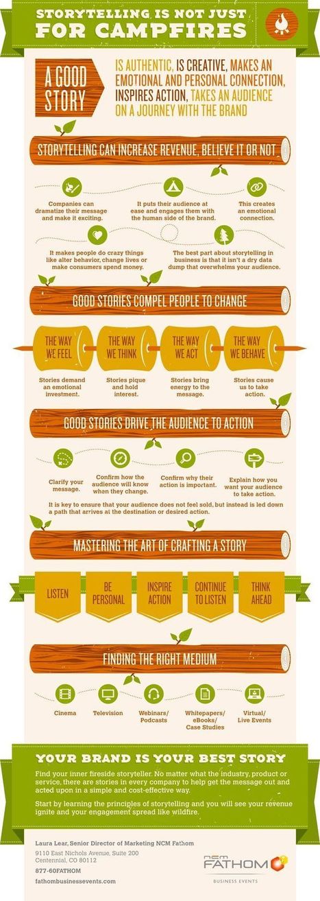
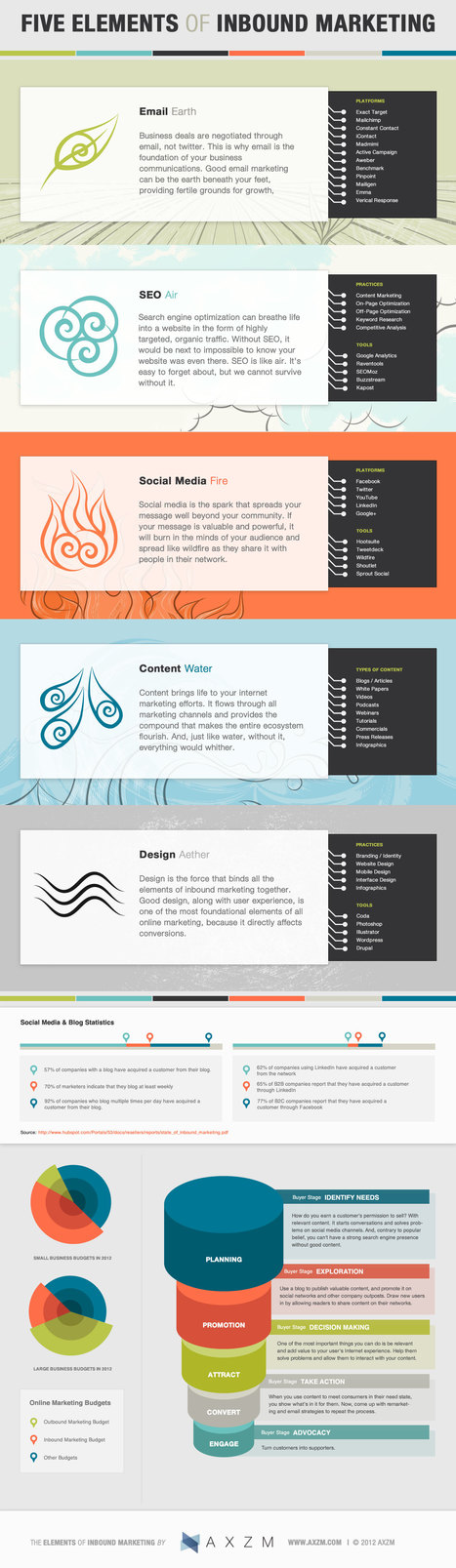
Recently we came across this great infographic by AXZM detailing the five elements of inbound marketing for your business. While they seemed to have channeled Captain Planet to design and categorize this infographic; using Earth, Fire, Air, Water, and the fifth element “Aether” that binds all other forces together.


It’s a great guide for a marketer or business owner just starting out in marketing. Each element is tied to an inbound marketing tactic and is partnered with a brief description of the benefit of each tactic, popular platforms, tools used and/ or best practices to implement.

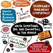
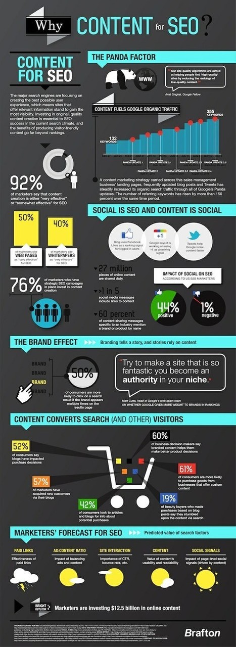
What is Inbound Marketing?

Inbound marketing is a relatively new marketing concept where marketers aim at getting discovered by potential customers who are actively looking for your product or solution. This idea of “being where your customers are looking” contrasts the traditional way of marketing through television commercials, cold calling, direct mail, trade shows, etc....

Jeff Domansky's curator insight, February 18, 2013 12:53 PM

Helpful look at inbound marketing from definition to tactics. All tied together nicely in an infographic. 

Scooped by Jeff Domansky
Scoop.it!

Why Content for SEO? | The Best Infographics on the Planet

Why Content for SEO? | The Best Infographics on the Planet | World's Best Infographics | Scoop.it

The major search engines are focusing on creating the best possible user experience, which means sites that offer relevant information gain the most visibility. Investing in original, quality content creation is essential to SEO success in the current search climate, and the benefits of producing visitor-friendly content go far beyond rankings.

Jeff Domansky's insight:

Get insight on the ins and outs of content for better SEO.

No comment yet.
Scooped by Jeff Domansky
Scoop.it!

The Business of Being Social [INFOGRAPHIC] | Parature

The Business of Being Social [INFOGRAPHIC] | Parature | World's Best Infographics | Scoop.it
Social media and the customer (and potential customer) data it provides ...
No comment yet.
Scooped by Jeff Domansky
Scoop.it!

Social at Work Infographic

Social at Work Infographic | World's Best Infographics | Scoop.it
Appirio has some statistics and an infographic out of a survey it conducted on the state of the social enterprise
No comment yet.