We live in an age of Big: Big Computers, Big Data, and Big Lies.
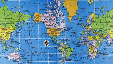
Faced with an unprecedented torrent of information, data scientists have turned to the visual arts to make sense of big data. The result of this unlikely marriage—often called "data visualizations" or "infographics"—has repeatedly provided us with new and insightful perspectives on the world around us.
However, time and time again we have seen that data visualizations can easily be manipulated to lie. By misrepresenting, altering, or faking the data they visualize, data scientists can twist public opinion to their benefit and even profit at our expense.
We have a natural tendency to trust images more than text. As a result, we’re easily fooled by data visualizations. But fortunately, there are three easy steps we can follow to save ourselves from getting duped in the data deluge....


 Your new post is loading...


Do visuals lie more easily? Infographics are all over the place nowadays. How do you know which ones to trust? Follow these three easy steps to save yourself from getting duped.
aggiungi la tua intuizione ...