World's Best Infographics
10.6K views | +0 today
Follow
World's Best Infographics
Celebrating the FINE ART of visual communication in social marketing
Curated by Jeff Domansky
Your new post is loading...
Rescooped by Jeff Domansky from Public Relations & Social Marketing Insight
Scoop.it!

Checklist: How To Get More Eyeballs On Your Infographics

Checklist: How To Get More Eyeballs On Your Infographics | World's Best Infographics | Scoop.it

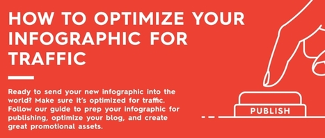
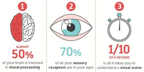
Just because you have an infographic designed does not mean it’s ready to go. There are a few more steps necessary to ensure success. You need to proofread. You need to publish. And, of course, you need to promote. Basically, you need to know how to optimize your infographic to get the most traffic.


Unfortunately, we see many brands make rookie mistakes in all three of these areas. Whether it’s an unoptimized file name, broken share buttons, or pixelated images, these details can seriously hurt your infographic’s success. If you want to get the most eyes on your infographic, there’s more to do than you think. But don’t worry.


Because our parent company Column Five likes to make things easier for you, they created this handy checklist to help you optimize your next infographic. They even put it in infographic form and checklist form. Feel free to print them out, bookmark them, or embed them on your site.


Follow their tips and you’ll know your infographic is really ready to be published. On that note, you can also take a look at these deep dives into how to optimize your infographic for SEO and how to optimize your blogfor content distribution. Good luck out there!...

Jeff Domansky's insight:

Think your infographic is ready to go? Wait a sec. Here's the checklist you need to make sure you optimize your infographic correctly

Jeff Domansky's curator insight, December 21, 2016 4:36 AM

Think your infographic is ready to go? Wait a sec. Here's the checklist you need to make sure you optimize your infographic correctly.

Naveen Dhollon's comment, March 1, 2019 7:07 AM
https://goo.gl/J6nFCw
Rescooped by Jeff Domansky from Public Relations & Social Marketing Insight
Scoop.it!

Whiskey 101: The Ultimate Guide | Daily Infographic

Whiskey 101: The Ultimate Guide | Daily Infographic | World's Best Infographics | Scoop.it
Drink up boys and girls. Today’s graphic will not only inform, but you’ll get to test your whiskey knowledge. How much do you know?
Jeff Domansky's insight:

This is one tasty infographic.

Jeff Domansky's curator insight, January 25, 2016 2:50 PM

This is one tasty infographic.

Rescooped by Jeff Domansky from Public Relations & Social Marketing Insight
Scoop.it!

What Makes Infographics Go Viral

What Makes Infographics Go Viral | World's Best Infographics | Scoop.it

So why are some infographics destined to die in obscurity while others get passed along to every corner of the web?


Content marketing researchers have been burning the midnight oil trying to figure out how to reliably produce viral content. After observing and analyzing a thousand different infographics across multiple industries and platforms, the team at SiegeMedia collected some interesting insights and patterns. As it turns out, going viral isn't entirely up to the hands of fate - the most popular content shared certain key characteristics.


Take a look at the following visual and learn what makes an infographic popular...

Jeff Domansky's insight:

Useful tips for more effective Infographics.

Jeff Domansky's curator insight, January 4, 2016 3:15 AM

Useful tips for more effective Infographics.

Marco Favero's curator insight, January 4, 2016 4:59 AM

aggiungere la vostra comprensione ...

Rescooped by Jeff Domansky from Public Relations & Social Marketing Insight
Scoop.it!

Data Visualization: How to Merge Form & Function & Make Great #Infographics

Data Visualization: How to Merge Form & Function & Make Great #Infographics | World's Best Infographics | Scoop.it

The following infographic, created by Zhenia Vasiliev, breaks down the basics of data visualization. It shows how beginners can merge form and function, and design meaningful infographics.


Key highlights:

-  Analyse your data: Analysis is the key. Before we can visualize the data we need to understand it.

-  Come up with a story: Story is finding a single strand of meaning in an endless sea of information. It has a beginning, middle and end.

-  Make it visible: Visualization is a creative act of making. Making the data visually elegant evident and engaging.

-  Entertain to educate: Good data design need to illuminate and inform the viewer, elucidate and illustrate the facts and stats....

Jeff Domansky's insight:

Useful tips on how to turn data into compelling content.

Jeff Domansky's curator insight, June 9, 2015 1:32 AM

Useful tips on how to turn data into compelling content.

Rescooped by Jeff Domansky from Public Relations & Social Marketing Insight
Scoop.it!

Make a boring business beautiful with infographic marketing

Make a boring business beautiful with infographic marketing | World's Best Infographics | Scoop.it

I’ve never met anyone who dreamed of integrating EHR software or auditing SOX compliance as a child. And I certainly don’t recall my mother sewing together a B2B content marketer costume for my first Halloween.*


But we’re actually in excellent company. The trouble is, however, your business can no longer rely on boring, boilerplate text to fill its funnel. That’s why I’d encourage you to spice up your content cookbook with a bit of infographic marketing.

,*It was a Peter Pan costume, and it was flawless.


Why do infographics outperform vanilla text?...

Jeff Domansky's insight:

Infographic marketing can help any business - no matter how technical or niche - spice up its web presence with attractive visuals that tell an interesting story.

Jeff Domansky's curator insight, April 16, 2015 3:51 AM

Infographic marketing can help any business - no matter how technical or niche - spice up its web presence with attractive visuals that tell an interesting story.

Rescooped by Jeff Domansky from Public Relations & Social Marketing Insight
Scoop.it!

The 15 Best Infographics of 2014

The 15 Best Infographics of 2014 | World's Best Infographics | Scoop.it

Every year people proclaim the death of something or other in marketing -- and the death of the infographic doesn't escape conversation. It's probably because while more people have caught on to the power of infographics for communications or marketing initiatives, not all of them are doing it well -- so it's hard to separate the wheat from the chaff.


These 15, however, managed to stand out. My criteria here were not scientific. I looked for infographics that I simply could not stop reading til the very end -- or in the case of the interactive ones in the latter half of this post, the ones I couldn't stop exploring. Enjoy perusing the best of what 2014's infographics had to offer, ranked in no particular order (except for #1 -- I love #1)....

Jeff Domansky's insight:

Truly amazing content, creativity and inspiration. You'll learn and enjoy these infographics hugely. Recommended viewing. 10 / 10

Jeff Domansky's curator insight, December 18, 2014 10:11 AM

Take a look at the top static and interactive infographics of 2014. They are simply amazing from design to content and impact! They must read for marketing, design and PR pros. 11/10 LOL

MNY's curator insight, December 23, 2014 6:29 AM

#infographie

Rescooped by Jeff Domansky from Public Relations & Social Marketing Insight
Scoop.it!

Infographics: Everything You Need to Know

Infographics: Everything You Need to Know | World's Best Infographics | Scoop.it

Are you ready to use infographics in your social media marketing?


Do you know how to get started?


Creating infographics is getting easier. When you illustrate a concept with images, you’re likely to find a bump in social media visibility.


In this article you’ll discover how to create and promote infographics to put your content front and center....

Jeff Domansky's insight:

Awesome tips. Recommended reading 9/10

Jeff Domansky's curator insight, September 26, 2014 10:06 AM

Valuable infographics tips and advice. Recommended reading 9/10

Rescooped by Jeff Domansky from Public Relations & Social Marketing Insight
Scoop.it!

The Science Behind Why Our Brains Crave Infographics (In an Infographic)

The Science Behind Why Our Brains Crave Infographics (In an Infographic) | World's Best Infographics | Scoop.it

Think back to your first memory: Can you still see the watermelon pink dress you wore? Do you remember the unique checkered pattern of your father's jacket?

Our memories are often linked to visual and sensory elements, while the words spoken or read can be more hazy. That's because our brains have a high capacity for storing visuals in our long-term memory, while text enters our working memory, which is limited. 


This contributes to why infographics and the inclusion of visual content in online information has been so successful. Readers crave visual breaks from the overload of text-based information that floods our daily browsing and work-related activities. 

NeoMam Studios studied how people process visual information, how visuals affect the way we read, and why graphics are so appealing. Discover the science behind why our brains crave infographics....

Jeff Domansky's insight:

Here's why our brains crave infographics... in an infographic.

 
Jeff Domansky's curator insight, June 5, 2016 11:51 PM

Here's why our brains crave infographics... in an infographic.

Scooped by Jeff Domansky
Scoop.it!

10 best design infographics of 2015 | Creative Bloq

10 best design infographics of 2015 | Creative Bloq | World's Best Infographics | Scoop.it

It's fair to say that 2015 has been an explosive year for infographics. Thanks to viral posts that explore everything from the risks of drinking diet coke, to quick funny hits exploring the creative process, the last twelve months have seen some amazing data visualizations.Unsuprisingly, some of the most beautiful and educational infographics in 2015 have been all about design, so we've collected 10 of the best below to round off your year and kickstart your creativity for 2016....

Jeff Domansky's insight:

Creative Bloq rounds up the biggest design infographics from the last year in this info-stuffed list.

Jeff Domansky's curator insight, January 16, 2016 2:48 AM

Creative Bloq rounds up the biggest design infographics from the last year in this info-stuffed list.

Rescooped by Jeff Domansky from Public Relations & Social Marketing Insight
Scoop.it!

The Process of Infographic Design simplified | Visme

The Process of Infographic Design simplified | Visme | World's Best Infographics | Scoop.it

The mere thought of creating your own infographic can be scary and often is thought of as a complex task that can entail tens of hours.

Visme is about simplifying the infographic creation process, so we thought: why not use our own tool to show you how to create your own infographic?

We collaborated with Randy Krum of Cool Infographics, an expert in data visualization and author of the book “cool Infographics”  to create a simple interactive infographic that breaks down the process of designing an infographic into 5 easy to understand steps.

Check it out and rollover each section for more information....

Jeff Domansky's insight:

The 1-2-3's of creating infographics in - what else - an infographic from Visme.

Jeff Domansky's curator insight, June 24, 2015 9:38 PM

The 1-2-3's of creating infographics in - what else - an infographic from Visme.

Marco Favero's curator insight, June 25, 2015 4:04 AM

aggiungi la tua intuizione ...

Rescooped by Jeff Domansky from Public Relations & Social Marketing Insight
Scoop.it!

7 Steps to turn data into a clear, concise infographic

7 Steps to turn data into a clear, concise infographic | World's Best Infographics | Scoop.it

This infographic about infographics utilizes a cool blueprint flowchart concept.. something you’d think of as stereotypical for a blueprint. It’s cool, but it might be a tad ironic – it’s harder to read than you’d like it to be. Let’s jump into the things that you should focus on to make sure your infographic looks simple, readable and beautiful.

Jeff Domansky's insight:

Usefl tips for better Infographics.

Jeff Domansky's curator insight, June 9, 2015 1:08 AM

Not sure where to start with your first infographic? Follow these simple 6 steps to transform your information into a clear and concise infographic.

Scooped by Jeff Domansky
Scoop.it!

How to Create Awesome Infographics Without Being a Designer

How to Create Awesome Infographics Without Being a Designer | World's Best Infographics | Scoop.it

Sometimes you’re surfing around the web and you notice some really cool infographic on something like fashion, music, or food, and you can’t help but wish that you could create something like that; even if it’d take you a week.


Well, I’m here to tell you that it’s definitely possible to create some awesome infographics in any category that you choose, EVEN if you’re not a designer. In this blog post, I’m going to introduce you to three awesome tools to create the best infographics, tell you how to use them AND how you can share your infographics in different channels all over the web. So, let’s get started!

Jeff Domansky's insight:

There's no reason not to create your own effective infographics with these three tools.

Marco Favero's curator insight, January 2, 2015 3:59 AM

aggiungi la tua intuizione ...

Rescooped by Jeff Domansky from Public Relations & Social Marketing Insight
Scoop.it!

5 Great Online Tools for Creating Infographics | Cool Infographics

5 Great Online Tools for Creating Infographics | Cool Infographics | World's Best Infographics | Scoop.it
Creating infographics using online tools has never been easier. In the last few years a number of online tools have emerged that allow anyone to create great visual content.  Whether you are working on a project for work, personal use, or social media, each new project starts with a template. With the dimensions laid out for you, you can focus your attention on quickly creating effective designs. Search, drag, and publish - it can be that simple.

These new tools are vector graphics applications that run in your browser as a replacement for using an expensive professional desktop application like Adobe Illustrator to put your infographic design together.  Each one offers different tools, image libraries, charts, fonts and templates as a starting point.  None of these have the full capabilities of a professional desktop application, but you probably don’t need that much power to create a simple infographic.

In this article, we take a quick look at 5 of the best online tools for creating infographics: Visme, Canva, Easel.ly, Piktochart, and Infogr.am. All of these tools are evolving quickly, and this is just a snapshot of their current capabilities.
Jeff Domansky's insight:

My favorite - Piktochat - gets a well-deserved positive review from Randy Krum at Cool Infographics.

Jeff Domansky's curator insight, October 19, 2014 9:56 PM

My favorite - Piktochat - gets a well-deserved positive review from Randy Krum at Cool Infographics.

Sean Hutchinson's curator insight, October 20, 2014 5:20 AM

A guide provided by www.coolinfographics.com. Proven to be the most highly effective way to grab the attention of your audience.