

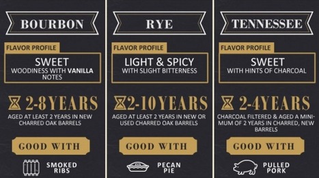

Drink up boys and girls. Today’s graphic will not only inform, but you’ll get to test your whiskey knowledge. How much do you know?
Get Started for FREE
Sign up with Facebook Sign up with X
I don't have a Facebook or a X account


 Your new post is loading...
 Your new post is loading...
Your new post is loading...
Drink up boys and girls. Today’s graphic will not only inform, but you’ll get to test your whiskey knowledge. How much do you know?
Jeff Domansky's insight:
This is one tasty infographic. 
While great infographics come in a variety of forms, the common thread is that they're visually pleasing and designed in a way that makes complex topics easy to understand whether you're a novice in the subject or an expert.
Jeff Domansky's insight:
Lots of infographics inspiration.

Claude Maran - Webmarketer's curator insight,
August 14, 2015 4:01 PM
ajouter votre perspicacité ... 
Elias "Estatistics" Tsolis's comment,
August 15, 2015 10:56 AM
the only one that i liked was this about plastic bugs

If you’re anything like me, you learned how to use programs like Photoshop and Gimp out of necessity to do minor changes to photos. You might have even dabbled in some easier graphic design projects for your own website, but it takes you hours to get the image or the design looking just right and you’re left exhausted. You might even spend time looking up tutorials on how to achieve a certain effect and still have trouble re-creating it. In short, while you do know your way around the programs like Photoshop to a certain extent, it takes you forever and there’s absolutely no way you’d call yourself a graphic designer. But then, you’re surfing around the web and you noticed some really cool infographics on things like fashion, music and food and you can’t help but wish that you could create something like that; even if it’d take you a week....
Jeff Domansky's insight:
Cool infographics tools

Gust MEES's curator insight,
December 31, 2014 9:51 AM
If you’re anything like me, you learned how to use programs like Photoshop and Gimp out of necessity to do minor changes to photos. You might have even dabbled in some easier graphic design projects for your own website, but it takes you hours to get the image or the design looking just right and you’re left exhausted. You might even spend time looking up tutorials on how to achieve a certain effect and still have trouble re-creating it. In short, while you do know your way around the programs like Photoshop to a certain extent, it takes you forever and there’s absolutely no way you’d call yourself a graphic designer. But then, you’re surfing around the web and you noticed some really cool infographics on things like fashion, music and food and you can’t help but wish that you could create something like that; even if it’d take you a week.... Learn more: - http://www.scoop.it/t/21st-century-tools-for-teaching-people-and-learners/?tag=infographics 
Michelle Gilstrap's curator insight,
December 31, 2014 4:02 PM
Always good to have a way to create good designs.
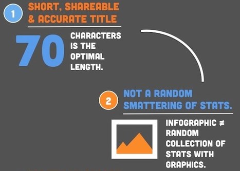
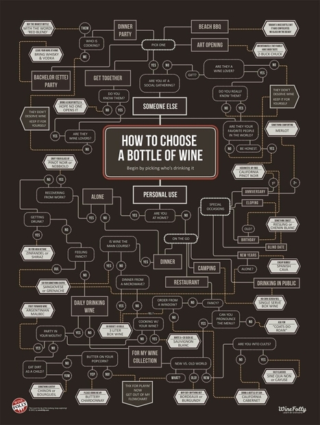
Make sure your infographics don't fall flat. Learn what essential elements you need to increasing sharing. Luckily, there are few things we can do to infographics to hedge our bets a bit. So, we put together the following infographic on making highly shareable infographics -- helping you rake in more views and conversion opportunities. Follow these tips, and your infographic will be much more likely to get shared.
Jeff Domansky's insight:
Here are six key elements to an effective infographic. HubSpot also offers five free templates for quickly creating infographics using PowerPoint. It's surprisingly easy.

Jeff Domansky's curator insight,
June 9, 2014 7:46 PM
Here are six key components to a highly shareable infographics from Ginny Soskey at HubSpot. Plus five free templates to help you create infographics quickly using PowerPoint. 
Sunil Saxena's curator insight,
June 10, 2014 11:14 AM
The web has given a new lease of life to infographics. They are easy to follow, and better than reading a 700-word article. You don't have to be a design editor to make them. Some of the tools being used today are simple, and easy to master. This article gives you an understanding of the elements of an infographic.
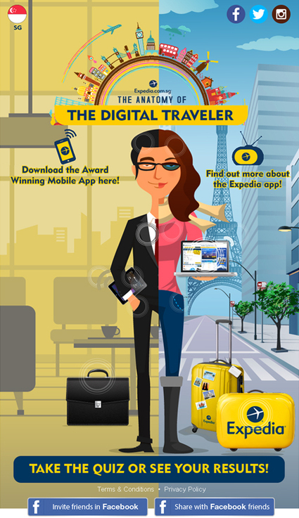
The team decided on an interactive infographic (or what we coined as an “Interac-phic”) to gain mindshare through social media platforms. Seeing how SG travellers are increasingly travel-savvy, we sensed an opportunity to allow users to explore the app and discover these travel trends for themselves. Expedia loved our idea and energy. Furthermore, after witnessing our creative sensibilities, they gave us the freedom to play pilot in the Expedia cockpit and deliver beyond what was initially expected. After expanding the concept, Expedia saw what could be achieved and were behind us all the way. We got cracking on the project with a programming resource, and the “The Anatomy of the Digital Traveller” campaign was launched in December 2013....
Jeff Domansky's insight:
Look out for interact-phics - interactive infographics - to blossom.
Jeff Domansky's curator insight,
March 16, 2014 11:10 PM
Good social marketing case study by the Hoffman Agency using the interact-phic or interactive infographic. Recommended reading for PR, marketing and content marketing pros. 9/10
The Internet is constantly changing and evolving alongside human demand and technological growth. From first public availability in 1994 to now, we've seen a major transformation from text-based to graphic-based design... and it looks like the visual web trend is here to stay and will rule the next web world. Let's take a look below infographic by ON team to see how visually oriented content has exploded in the past few years, why it works - and the future of the visual web..…
Jeff Domansky's curator insight,
November 16, 2013 2:13 AM
Take a look at this infographic to see how visually oriented content has exploded in the past few years, why it works - and the future of the visual web. |
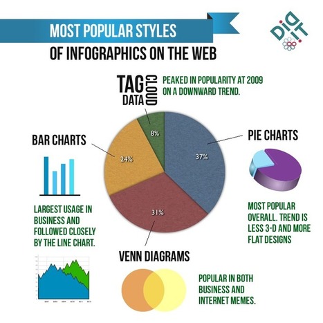
Infographics have become the design darling of visual marketing. It’s no wonder organizations and individuals are taking advantage of them as a communication tool. We’ve scoured the web to compile a collection of 45 inspiring infographics that show what’s possible in this design category. Browse through them to get some ideas for your next project....
Jeff Domansky's insight:
Take a look at how these infographics transformed tedious data into enlightening visuals — and learn some interesting trivia while you're at it!
Jeff Domansky's curator insight,
September 19, 2015 6:02 AM
Take a look at how these infographics transformed tedious data into enlightening visuals — and learn some interesting trivia while you're at it! 
Jasmin Davies-Hodge's curator insight,
September 21, 2015 4:13 AM
#infographics an excellent visual communication tool
We all know a picture speaks thousand words and for that reason infographics are being more popular due to its amazing information displayed in the form of images. It has the capability to capture everyone’s eye and tell them a story with engaging content and images. It’s an all in one package with text, images and creative design that come all along. It holds a great marketing potential that has the ability to attract customers. Many people click on infographics as it is more appealing and hence your web traffic is increased which is beneficial aspect for SEO.
Jeff Domansky's insight:
Great collection of social media infographics. Well worth reading. 9/ 10
Jeff Domansky's curator insight,
December 7, 2014 11:26 PM
Great collection and useful reading for marketers, and social media pros. 
rodrick rajive lal's curator insight,
December 9, 2014 1:53 AM
These are some interesting infographics that provide a pictorial representation of data in a form that can be easily understood. In an age where the quantum of data is increasing exponentially, it has become extremely important to use infographics. Raw data and statistics can become a turn off, especially for those who don't have an eye for figures! Infographics are being used very successfully in schools and colleges to present information in an easily assimilable form.

Infographics are everywherebut what made them so successful?This infographic exposes the science behind the boom....
Jeff Domansky's insight:
This HTML 5 interactive infographic explains why infographics are so effective.
Jeff Domansky's curator insight,
October 21, 2014 2:52 AM
This HTML 5 interactive infographic explains why infographics are so effective.
What are the current trends with infographics in 2014? Infographics have always been around, but the emergence of “Big Data” has caused the display of trends and statistical correlations using “little men” and 3-D pie charts to become more popular than ever. Why? As a society we’ve become inundated with piles of alphanumeric data each day. Infographics takes this content and boils it down to essential, understandable visual elements. Additionally, as a content building/content marketing tactic, infographics can provide a break from “dry text,” causing users to spend more time on the page. But as the novelty of infographics has faded, more and more bad infographics saturate the web landscape. In order for infographics to be effective, they need to use multiple data points to tell a cohesive story or prove a theory. After some research, I found some interesting trends affecting the infographics space....
Jeff Domansky's insight:
Good look at infographics trends by Aaron Kupferberg.
Jeff Domansky's curator insight,
May 14, 2014 2:49 AM
Aaron Kupferberg offers a look at infographics trends.

...Did you know that color accounts for 85% of the reason why you purchased a specific product? Or that full-colored ads in magazines are recognized 26% more than black and white ads? The psychological elements go even deeper when you look at the specific meanings of colors. For example, if you use the color blue on your products, it will give your customers a calming effect…while black, on the other hand, gives your customers a sense of exclusivity. So, the real question that comes to mind is: how should you use color within your marketing?...
Jeff Domansky's insight:
Neil Patel paints a picture of how color impacts response and marketing.

Intriguing Networks's curator insight,
January 27, 2014 3:11 PM
Designers ignore this at your peril and marketers make sure your designers knows, becuase they don't always like 'evidence' to spoil their scheme... 
Marie Clement's curator insight,
January 30, 2014 8:11 AM
Interesting article - the blue & orange combination to attract impulse buyers is evident on most eCommerce sites - now I know why! |


This is one tasty infographic.