World's Best Infographics
10.6K views | +0 today
Follow
World's Best Infographics
Celebrating the FINE ART of visual communication in social marketing
Curated by Jeff Domansky
Your new post is loading...
Rescooped by Jeff Domansky from Public Relations & Social Marketing Insight
Scoop.it!

10 Types of Infographics: Which One Works For You?

10 Types of Infographics: Which One Works For You? | World's Best Infographics | Scoop.it

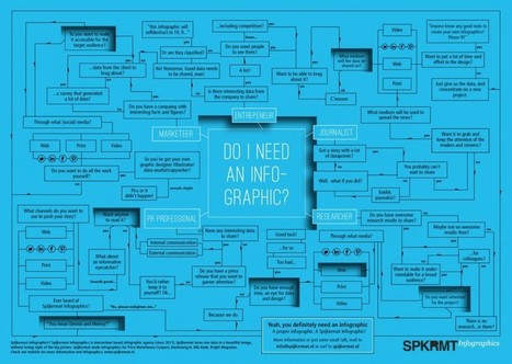
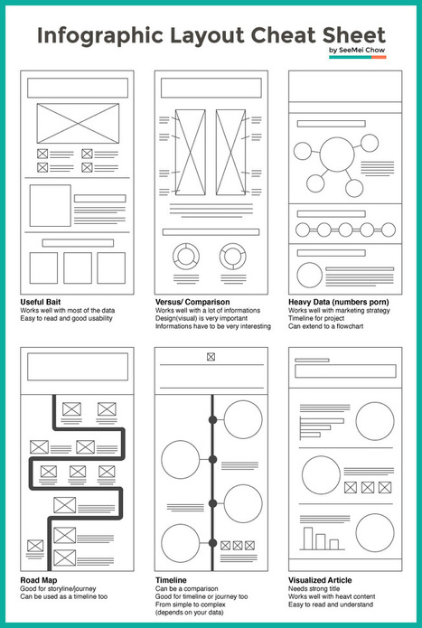
Creating a really cool, memorable and–above all–shareable infographic comes down to investing the necessary time and attention in all the steps that lead up to an awesome data visualization.

In a previous series of posts, we discussed the steps to creating your own infographic. One of the key elements in this process is understanding that information can be categorized in one of five ways:

  • Chronologically
  • Alphabetically
  • Geographically
  • Categorically
  • Hierarchically


The visual format you choose will depend on how you want to organize your information. To help you identify which type of infographic will best serve your purpose and audience, we’ve compiled a list of the most-used types, along with advice on when to use them and examples of each....

Jeff Domansky's insight:

Useful idea triggers for your next infographic project from Visme.

Jeff Domansky's curator insight, November 23, 2015 9:37 PM

Useful idea triggers for your next infographic project from Visme.

Juhana Peltomaa's curator insight, November 24, 2015 6:11 AM

Tell your numbers as a part of your #BrandStory.

Rescooped by Jeff Domansky from Public Relations & Social Marketing Insight
Scoop.it!

Layout #2: Designing A Comparison Infographic - Piktochart

Layout #2: Designing A Comparison Infographic - Piktochart | World's Best Infographics | Scoop.it

A 2013 study by Louis Alfieri published on Educational Psychologist suggested that case comparison activities commonly led to greater learning outcomes over other forms of case study including sequential, single case, and non-analogous, as well as traditional instruction.


Today, we are going to learn how to take advantage of this concept and apply it to design an excellent educational infographic.Keep reading!...

Jeff Domansky's insight:

If you ever had to compare and contrast two things, sides or opinions, you've come to the right place. Learn to do it with an infographic!

Jeff Domansky's curator insight, September 19, 2015 6:19 AM

If you ever had to compare and contrast two things, sides or opinions, you've come to the right place. Learn to do it with an infographic!

Rescooped by Jeff Domansky from Public Relations & Social Marketing Insight
Scoop.it!

7 Steps to turn data into a clear, concise infographic

7 Steps to turn data into a clear, concise infographic | World's Best Infographics | Scoop.it

This infographic about infographics utilizes a cool blueprint flowchart concept.. something you’d think of as stereotypical for a blueprint. It’s cool, but it might be a tad ironic – it’s harder to read than you’d like it to be. Let’s jump into the things that you should focus on to make sure your infographic looks simple, readable and beautiful.

Jeff Domansky's insight:

Usefl tips for better Infographics.

Jeff Domansky's curator insight, June 9, 2015 1:08 AM

Not sure where to start with your first infographic? Follow these simple 6 steps to transform your information into a clear and concise infographic.

Rescooped by Jeff Domansky from Public Relations & Social Marketing Insight
Scoop.it!

How to Create Awesome Infographics Without Being a Designer

How to Create Awesome Infographics Without Being a Designer | World's Best Infographics | Scoop.it

Well, I’m here to tell you that it’s definitely possible to create some awesome infographics in any category that you choose, EVEN if you’re not a designer. In this blog post, I’m going to introduce you to three awesome tools to create the best infographics, tell you how to use them AND how you can share your infographics in different channels all over the web. So, let’s get started!..

Jeff Domansky's insight:

Basic infographics tips from Lillian Sue.

Well Connected Mom's curator insight, April 10, 2015 4:11 PM

Infographics makes statistics visually interesting and more palatable.

judyhaar's curator insight, April 20, 2015 1:19 PM

Info graphics are the norm. Get onboard!

Daniel de Lisle's curator insight, April 23, 2015 5:05 PM

New to infographics and want to get a handle on how to make complex data speak to your clients then read on.

Rescooped by Jeff Domansky from Public Relations & Social Marketing Insight
Scoop.it!

Infographic Design: 6 Ways To Use Icons - Venngage

Infographic Design: 6 Ways To Use Icons - Venngage | World's Best Infographics | Scoop.it

Do you want to make your infographics iconic? Okay, so we don’t mean “iconic” in the usual sense. We mean using icons in your infographic design. Icons are those little illustrative graphic images/clip art that represent an object, action or idea. They are often stylized and simplified designs. N


Using icons can make your infographic design more cohesive and more professional. With Venngage you can choose from over 10,000 icons in our icon library and stylize them to your preference by editing their colors, sizes and positions.  Here are some tips for how to use icons in your infographics....

Jeff Domansky's insight:

6 ways to use icons in your infographic design. Quick infographic tips from Venngage.

Jeff Domansky's curator insight, October 21, 2015 10:50 AM

6 ways to use icons in your infographic design. Quick infographic tips from Venngage.

Rescooped by Jeff Domansky from Public Relations & Social Marketing Insight
Scoop.it!

45 Complex Topics Explained Perfectly By Infographics – Canva

45 Complex Topics Explained Perfectly By Infographics – Canva | World's Best Infographics | Scoop.it

Infographics have become the design darling of visual marketing.


It’s no wonder organizations and individuals are taking advantage of them as a communication tool. We’ve scoured the web to compile a collection of 45 inspiring infographics that show what’s possible in this design category. Browse through them to get some ideas for your next project....

Jeff Domansky's insight:

Take a look at how these infographics transformed tedious data into enlightening visuals — and learn some interesting trivia while you're at it!

Jeff Domansky's curator insight, September 19, 2015 6:02 AM

Take a look at how these infographics transformed tedious data into enlightening visuals — and learn some interesting trivia while you're at it!

Marco Favero's curator insight, September 21, 2015 2:41 AM

aggiungere la vostra comprensione ...

Jasmin Davies-Hodge's curator insight, September 21, 2015 4:13 AM

#infographics an excellent visual communication tool

Rescooped by Jeff Domansky from Public Relations & Social Marketing Insight
Scoop.it!

14 amazing infographics on web design that you can not miss

14 amazing infographics on web design that you can not miss | World's Best Infographics | Scoop.it

Creativity and great ideas can be dosed in a masterly way of aninfographic. Those 14 infographics is proof of that. They are tremendously useful information, it does so with full creativity and originality. Although most of them are about web design, some of those is also for SEO professionals or graphic designers themselves. I recommend you take a look at them because from the visual and composition view are very well developed....

Jeff Domansky's insight:

Great collection of Infographics for web design ideas.

Jeff Domansky's curator insight, April 18, 2015 2:38 AM
Great collection of Infographics for web design ideas.
Rescooped by Jeff Domansky from Public Relations & Social Marketing Insight
Scoop.it!

Layout Cheat Sheet for Infographics : Visual arrangement tips

Layout Cheat Sheet for Infographics : Visual arrangement tips | World's Best Infographics | Scoop.it

Infographic layouts refer to the arrangement of your visual elements and your content. When you begin working on a piece of infographic, you should have a story to tell hence, you will need to select a layout that best suits your story. Using the right layout will ensure good readability and convey your message well.


We have put together a cheat sheet for your quick reference to the right arrangement to use, here are six common ones you can quickly work with....

Jeff Domansky's insight:

Is this an awesome cheat sheet for web design and infographics pros or what? 

Tony Guzman's curator insight, March 2, 2015 3:29 PM

This article helps you determine the best layout for the type of infographic you may be creating.

David Baker's curator insight, March 13, 2015 1:21 AM

This is a great tool to share with my seminar teachers whose final project for the year is an infographic.

Monica S Mcfeeters's curator insight, March 20, 2015 11:51 PM

HERE ARE SOME HELPFUL LAYOUTS TO SPEED UP YOUR DESIGNS.