World's Best Infographics
10.6K views | +0 today
Follow
World's Best Infographics
Celebrating the FINE ART of visual communication in social marketing
Curated by Jeff Domansky
Your new post is loading...
Rescooped by Jeff Domansky from Public Relations & Social Marketing Insight
Scoop.it!

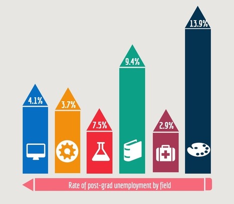
Infographic Design: 6 Ways To Use Icons - Venngage

Infographic Design: 6 Ways To Use Icons - Venngage | World's Best Infographics | Scoop.it

Do you want to make your infographics iconic? Okay, so we don’t mean “iconic” in the usual sense. We mean using icons in your infographic design. Icons are those little illustrative graphic images/clip art that represent an object, action or idea. They are often stylized and simplified designs. N


Using icons can make your infographic design more cohesive and more professional. With Venngage you can choose from over 10,000 icons in our icon library and stylize them to your preference by editing their colors, sizes and positions.  Here are some tips for how to use icons in your infographics....

Jeff Domansky's insight:

6 ways to use icons in your infographic design. Quick infographic tips from Venngage.

Jeff Domansky's curator insight, October 21, 2015 10:50 AM

6 ways to use icons in your infographic design. Quick infographic tips from Venngage.

Rescooped by Jeff Domansky from Public Relations & Social Marketing Insight
Scoop.it!

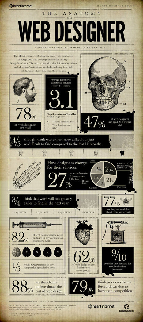
15 Interesting Infographics Web Designers Will Enjoy

15 Interesting Infographics Web Designers Will Enjoy | World's Best Infographics | Scoop.it

The bold visual design of Infographics makes it easy to digest facts and figures about a given subject. There’s some great infographics based on interesting topics related to web design, from articles explaining the benefits of responsive design to interesting statistics about the industry. Today I showcase 15 interesting Infographics that every web designer will enjoy. Give your scrolling finger some exercise as you browse through this lengthy post!...

Jeff Domansky's insight:

Very creative! Recommended viewing. 9/10

Jeff Domansky's curator insight, October 21, 2014 3:50 AM

Very creative!

Paul Leslie's curator insight, October 21, 2014 4:17 AM

Some great ideas for our year 4 students on how to represent their data.

kmmk's curator insight, October 23, 2014 6:24 AM
Great visuals with nice Stats :-)
Rescooped by Jeff Domansky from Public Relations & Social Marketing Insight
Scoop.it!

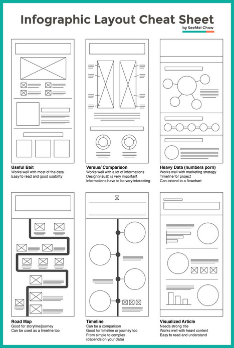
Layout Cheat Sheet for Infographics : Visual arrangement tips

Layout Cheat Sheet for Infographics : Visual arrangement tips | World's Best Infographics | Scoop.it

Infographic layouts refer to the arrangement of your visual elements and your content. When you begin working on a piece of infographic, you should have a story to tell hence, you will need to select a layout that best suits your story. Using the right layout will ensure good readability and convey your message well.


We have put together a cheat sheet for your quick reference to the right arrangement to use, here are six common ones you can quickly work with....

Jeff Domansky's insight:

Is this an awesome cheat sheet for web design and infographics pros or what? 

Tony Guzman's curator insight, March 2, 2015 3:29 PM

This article helps you determine the best layout for the type of infographic you may be creating.

David Baker's curator insight, March 13, 2015 1:21 AM

This is a great tool to share with my seminar teachers whose final project for the year is an infographic.

Monica S Mcfeeters's curator insight, March 20, 2015 11:51 PM

HERE ARE SOME HELPFUL LAYOUTS TO SPEED UP YOUR DESIGNS.

Scooped by Jeff Domansky
Scoop.it!

The Psychology of Colors [infographic]

The Psychology of Colors [infographic] | World's Best Infographics | Scoop.it
The psychology behind color has been well documented. Red makes you hungry, pink rooms calm you down, and green is very tranquil.
No comment yet.