World's Best Infographics
10.6K views | +0 today
Follow
World's Best Infographics
Celebrating the FINE ART of visual communication in social marketing
Curated by Jeff Domansky
Your new post is loading...
Rescooped by Jeff Domansky from Public Relations & Social Marketing Insight
Scoop.it!

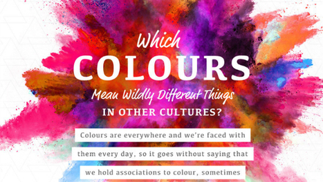
Which Colors Mean Wildly Different Things In Other Cultures? - DesignTAXI.com

Which Colors Mean Wildly Different Things In Other Cultures? - DesignTAXI.com | World's Best Infographics | Scoop.it

One of the most fun things to do in design is swirling the latest color trends into your work. Color is a fascinating topic, and even a generator that understands color theory has recently been invented. Because they mean different things, companies also actively use color in their brand designs to encourage feelings and behaviors from customers. However, in different cultures, color theory isn’t all black-and-white. 


In this delightful infographic, SilverDoor describes color associations of different cultures, adding contrast to the way you think. Telling a person from another part of the world that you’re “feeling blue” may mean something entirely different to them. Is your favorite color offensive to another culture? Find out in the infographic below....

Jeff Domansky's insight:

Surprising meaning of colors in other cultures.

Ashley Villegas's curator insight, April 13, 2017 11:59 AM

Really cool... 

Michelle Harris's curator insight, April 13, 2017 1:20 PM

Very interesting article that I wish I had read years ago.  Happy reading....

rodrick rajive lal's curator insight, April 14, 2017 1:09 AM
Strangely enough, colours have different meanings in different cultures! In India, white used to be the colour worn by widows in mourning, while in the West, black is the colour preferred by those in mourning. On the whole, however, most colours have the same meaning across most cultures. Green might be the symbol for agriculture. 
4
Rescooped by Jeff Domansky from Public Relations & Social Marketing Insight
Scoop.it!

How to Create Awesome Infographics Without Being a Designer

How to Create Awesome Infographics Without Being a Designer | World's Best Infographics | Scoop.it

Well, I’m here to tell you that it’s definitely possible to create some awesome infographics in any category that you choose, EVEN if you’re not a designer. In this blog post, I’m going to introduce you to three awesome tools to create the best infographics, tell you how to use them AND how you can share your infographics in different channels all over the web. So, let’s get started!..

Jeff Domansky's insight:

Basic infographics tips from Lillian Sue.

Well Connected Mom's curator insight, April 10, 2015 4:11 PM

Infographics makes statistics visually interesting and more palatable.

judyhaar's curator insight, April 20, 2015 1:19 PM

Info graphics are the norm. Get onboard!

Daniel de Lisle's curator insight, April 23, 2015 5:05 PM

New to infographics and want to get a handle on how to make complex data speak to your clients then read on.

Rescooped by Jeff Domansky from Public Relations & Social Marketing Insight
Scoop.it!

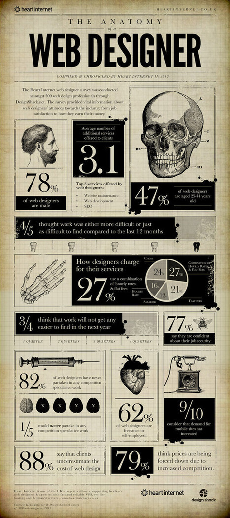
15 Interesting Infographics Web Designers Will Enjoy

15 Interesting Infographics Web Designers Will Enjoy | World's Best Infographics | Scoop.it

The bold visual design of Infographics makes it easy to digest facts and figures about a given subject. There’s some great infographics based on interesting topics related to web design, from articles explaining the benefits of responsive design to interesting statistics about the industry. Today I showcase 15 interesting Infographics that every web designer will enjoy. Give your scrolling finger some exercise as you browse through this lengthy post!...

Jeff Domansky's insight:

Very creative! Recommended viewing. 9/10

Jeff Domansky's curator insight, October 21, 2014 3:50 AM

Very creative!

Paul Leslie's curator insight, October 21, 2014 4:17 AM

Some great ideas for our year 4 students on how to represent their data.

kmmk's curator insight, October 23, 2014 6:24 AM
Great visuals with nice Stats :-)
Scooped by Jeff Domansky
Scoop.it!

The Psychology of Colors [infographic]

The Psychology of Colors [infographic] | World's Best Infographics | Scoop.it
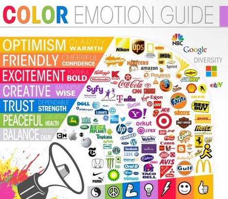
The psychology behind color has been well documented. Red makes you hungry, pink rooms calm you down, and green is very tranquil.
No comment yet.
Rescooped by Jeff Domansky from Public Relations & Social Marketing Insight
Scoop.it!

Infographic Design: 6 Ways To Use Icons - Venngage

Infographic Design: 6 Ways To Use Icons - Venngage | World's Best Infographics | Scoop.it

Do you want to make your infographics iconic? Okay, so we don’t mean “iconic” in the usual sense. We mean using icons in your infographic design. Icons are those little illustrative graphic images/clip art that represent an object, action or idea. They are often stylized and simplified designs. N


Using icons can make your infographic design more cohesive and more professional. With Venngage you can choose from over 10,000 icons in our icon library and stylize them to your preference by editing their colors, sizes and positions.  Here are some tips for how to use icons in your infographics....

Jeff Domansky's insight:

6 ways to use icons in your infographic design. Quick infographic tips from Venngage.

Jeff Domansky's curator insight, October 21, 2015 10:50 AM

6 ways to use icons in your infographic design. Quick infographic tips from Venngage.

Rescooped by Jeff Domansky from Public Relations & Social Marketing Insight
Scoop.it!

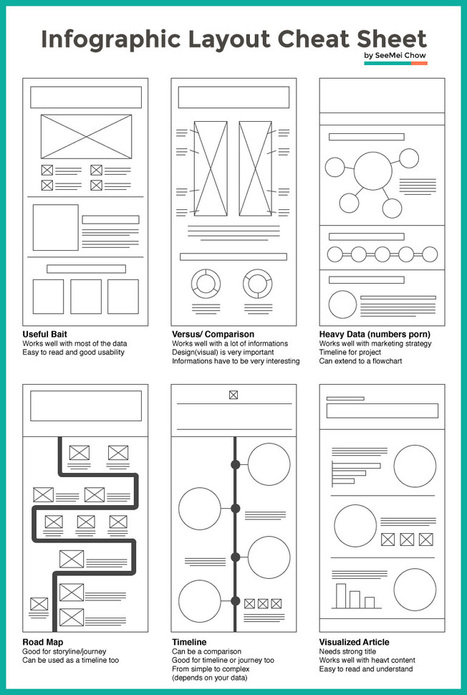
Layout Cheat Sheet for Infographics : Visual arrangement tips

Layout Cheat Sheet for Infographics : Visual arrangement tips | World's Best Infographics | Scoop.it

Infographic layouts refer to the arrangement of your visual elements and your content. When you begin working on a piece of infographic, you should have a story to tell hence, you will need to select a layout that best suits your story. Using the right layout will ensure good readability and convey your message well.


We have put together a cheat sheet for your quick reference to the right arrangement to use, here are six common ones you can quickly work with....

Jeff Domansky's insight:

Is this an awesome cheat sheet for web design and infographics pros or what? 

Tony Guzman's curator insight, March 2, 2015 3:29 PM

This article helps you determine the best layout for the type of infographic you may be creating.

David Baker's curator insight, March 13, 2015 1:21 AM

This is a great tool to share with my seminar teachers whose final project for the year is an infographic.

Monica S Mcfeeters's curator insight, March 20, 2015 11:51 PM

HERE ARE SOME HELPFUL LAYOUTS TO SPEED UP YOUR DESIGNS.

Scooped by Jeff Domansky
Scoop.it!

The 15 Logo Design Trends of 2013 | DesignTAXI.com

The 15 Logo Design Trends of 2013 | DesignTAXI.com | World's Best Infographics | Scoop.it

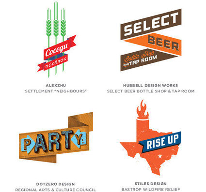
The observers at Logo Lounge have compiled 15 distinct logo design trends of 2013. By analysing more than 204,000 logos from more than 100 countries in their database, they were able to observe the types of logos which have emerged during the year. From logos which look like GPS markers to more ‘sciency’ ones which look like molecules, this report traces the evolution of each logo trend. The article also explains why recent logo types have emerged—mostly due to technological developments and trends present in society....

Jeff Domansky's insight:

Here's a little creative you can enjoy with your coffee....

No comment yet.
Scooped by Jeff Domansky
Scoop.it!

Welcome to World's Best Infographics

Welcome to World's Best Infographics | World's Best Infographics | Scoop.it

Welcome to World's Best Infographics.


This site is curated by Jeff Domansky, aka The PR Coach. While I'm a social PR consultant, I also appreciate the FINE ART of infographics. Sometimes they're art, sometimes they're marketing or information and when they work together, they are wonderful communication!


The infographics I curate here are mostly include marketing, public affairs, communications, branding, graphic design, social marketing, advertising and PR themes. Once in a while, just to shake things up, I like to add something off the wall. I hope you enjoy them.

No comment yet.