World's Best Infographics
10.6K views | +0 today
Follow
World's Best Infographics
Celebrating the FINE ART of visual communication in social marketing
Curated by Jeff Domansky
Your new post is loading...
Rescooped by Jeff Domansky from Public Relations & Social Marketing Insight
Scoop.it!

Which Colors Mean Wildly Different Things In Other Cultures? - DesignTAXI.com

Which Colors Mean Wildly Different Things In Other Cultures? - DesignTAXI.com | World's Best Infographics | Scoop.it

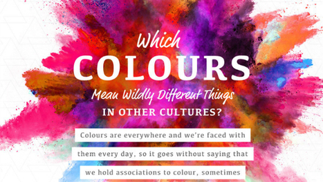
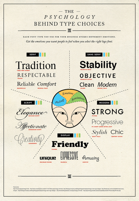
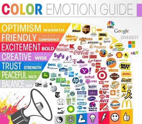
One of the most fun things to do in design is swirling the latest color trends into your work. Color is a fascinating topic, and even a generator that understands color theory has recently been invented. Because they mean different things, companies also actively use color in their brand designs to encourage feelings and behaviors from customers. However, in different cultures, color theory isn’t all black-and-white. 


In this delightful infographic, SilverDoor describes color associations of different cultures, adding contrast to the way you think. Telling a person from another part of the world that you’re “feeling blue” may mean something entirely different to them. Is your favorite color offensive to another culture? Find out in the infographic below....

Jeff Domansky's insight:

Surprising meaning of colors in other cultures.

Ashley Villegas's curator insight, April 13, 2017 11:59 AM

Really cool... 

Michelle Harris's curator insight, April 13, 2017 1:20 PM

Very interesting article that I wish I had read years ago.  Happy reading....

rodrick rajive lal's curator insight, April 14, 2017 1:09 AM
Strangely enough, colours have different meanings in different cultures! In India, white used to be the colour worn by widows in mourning, while in the West, black is the colour preferred by those in mourning. On the whole, however, most colours have the same meaning across most cultures. Green might be the symbol for agriculture. 
4
Rescooped by Jeff Domansky from Public Relations & Social Marketing Insight
Scoop.it!

45 Complex Topics Explained Perfectly By Infographics – Canva

45 Complex Topics Explained Perfectly By Infographics – Canva | World's Best Infographics | Scoop.it

Infographics have become the design darling of visual marketing.


It’s no wonder organizations and individuals are taking advantage of them as a communication tool. We’ve scoured the web to compile a collection of 45 inspiring infographics that show what’s possible in this design category. Browse through them to get some ideas for your next project....

Jeff Domansky's insight:

Take a look at how these infographics transformed tedious data into enlightening visuals — and learn some interesting trivia while you're at it!

Jeff Domansky's curator insight, September 19, 2015 6:02 AM

Take a look at how these infographics transformed tedious data into enlightening visuals — and learn some interesting trivia while you're at it!

Marco Favero's curator insight, September 21, 2015 2:41 AM

aggiungere la vostra comprensione ...

Jasmin Davies-Hodge's curator insight, September 21, 2015 4:13 AM

#infographics an excellent visual communication tool

Rescooped by Jeff Domansky from Public Relations & Social Marketing Insight
Scoop.it!

Timeline of the far future - Infographic

Timeline of the far future - Infographic | World's Best Infographics | Scoop.it
 What do we expect will happen in one thousand years time? Or one million years? Or even one billion? As our amazing timeline shows, there may be trouble ahead.

Via Ana Cristina Pratas, Jeff Domansky
Jeff Domansky's insight:

Fascinating to speculate on the future in this BBC infographic.

Laurent Grimbert's curator insight, November 10, 2014 4:34 AM

Life moves pretty fast, so you should stop and enjoy it once in a while, especially if you read this and discover what futur will be for humanity and Earth !!!

Benjamin Labarthe-Piol's curator insight, November 12, 2014 10:46 AM

Funny

Luc E. Morisset's curator insight, November 14, 2014 10:19 AM

Until earth dies, it leaves us plenty of time to do what matters most…

Rescooped by Jeff Domansky from Public Relations & Social Marketing Insight
Scoop.it!

25 Ideas to Transform Ho-Hum Infographics into Something Extraordinary - Copyblogger

25 Ideas to Transform Ho-Hum Infographics into Something Extraordinary - Copyblogger | World's Best Infographics | Scoop.it

A few weeks ago here on Copyblogger, Demian Farnworth presented the infographic as the Salvador Dalí of content marketing — the most interesting person at the cocktail party.


More than just a superficial presence, an infographic is a significant asset pillar with diverse possibilities that help you grow your media empire.Today, let’s equate the Internet to the world of pop music. In this case, infographics are The Beatles....

Jeff Domansky's insight:

Expand your audience and grow your online media empire with these 25 infographic ideas that help you distribute your educational content in innovative ways.

Jeff Domansky's curator insight, October 15, 2014 2:36 AM

Expand your audience and grow your online media empire with these 25 infographic ideas that help you distribute your educational content in innovative ways.

Marco Favero's curator insight, October 15, 2014 3:51 PM

aggiungi la tua intuizione ...

Rescooped by Jeff Domansky from Public Relations & Social Marketing Insight
Scoop.it!

A Pro Designer Shares the Psychology of Font Choices

A Pro Designer Shares the Psychology of Font Choices | World's Best Infographics | Scoop.it

Cool advice...Today’s infographic covers the psychology behind type choices. You will learn how serif, sans serif, script, modern, and display typefaces and their fonts are best used for moving your audience to feel how you want them to feel....

Tyler Negus Snidow's curator insight, July 9, 2013 8:02 AM

Great overview.  

Constance S. Ward's curator insight, July 12, 2013 11:56 AM
Learn more about a subtle form of non-verbal communication
Miriam Gilbert's curator insight, July 19, 2013 3:07 PM

nice infographic on how different fonts create a different "feel" for copy...

Scooped by Jeff Domansky
Scoop.it!

29 Ways to Stay Creative [infographic]

29 Ways to Stay Creative [infographic] | World's Best Infographics | Scoop.it

...The infographic I’m featuring today is pretty sweet because it gives you ways to keep your creative juices flowing.  By trying even a handful of these things, you’ll start to notice the creative beast in you coming out to play a little more often.  When good ideas come your way, hold on tight to them–write them down if you have to. Ideas tend to slip from our memory as easily as our dreams do.  Once you have a good grasp on your idea, dive in and watch it evolve....

Jeff Domansky's insight:

Just a little bit of creative fun with your coffee.

No comment yet.
Scooped by Jeff Domansky
Scoop.it!

Logos: A look up the meaning in colors | Daily Infographic

Logos: A look up the meaning in colors | Daily Infographic | World's Best Infographics | Scoop.it
There are thousands of companies marketing themselves to consumers (both prospective and returning) several times per day, all of them with their own unique logo.
No comment yet.
Scooped by Jeff Domansky
Scoop.it!

A History of Western Typefaces | Mashable

A History of Western Typefaces | Mashable | World's Best Infographics | Scoop.it
The Fontography Series is supported by join.me, the easiest way to have an online meeting. join.me lets you instantly share your screen with anyone, for free. Use it to collabor...
No comment yet.
Scooped by Jeff Domansky
Scoop.it!

The Psychology of Colors [infographic]

The Psychology of Colors [infographic] | World's Best Infographics | Scoop.it
The psychology behind color has been well documented. Red makes you hungry, pink rooms calm you down, and green is very tranquil.
No comment yet.
Scooped by Jeff Domansky
Scoop.it!

Win Rock Paper Scissors Every Time | Daily Infographic

Win Rock Paper Scissors Every Time | Daily Infographic | World's Best Infographics | Scoop.it
So the winner of this competition gets to be on TV (Even broadcasted in Turks and Caicos) and a check for $10,000. Yeah, where is this competition held, cause I'm in.
No comment yet.
Rescooped by Jeff Domansky from Public Relations & Social Marketing Insight
Scoop.it!

Infographic Design: 6 Ways To Use Icons - Venngage

Infographic Design: 6 Ways To Use Icons - Venngage | World's Best Infographics | Scoop.it

Do you want to make your infographics iconic? Okay, so we don’t mean “iconic” in the usual sense. We mean using icons in your infographic design. Icons are those little illustrative graphic images/clip art that represent an object, action or idea. They are often stylized and simplified designs. N


Using icons can make your infographic design more cohesive and more professional. With Venngage you can choose from over 10,000 icons in our icon library and stylize them to your preference by editing their colors, sizes and positions.  Here are some tips for how to use icons in your infographics....

Jeff Domansky's insight:

6 ways to use icons in your infographic design. Quick infographic tips from Venngage.

Jeff Domansky's curator insight, October 21, 2015 10:50 AM

6 ways to use icons in your infographic design. Quick infographic tips from Venngage.

Rescooped by Jeff Domansky from Public Relations & Social Marketing Insight
Scoop.it!

40 Creative Infographics for Designers and Developers | TheNeoDesign.com

40 Creative Infographics for Designers and Developers | TheNeoDesign.com | World's Best Infographics | Scoop.it

VMonths back we came up with the superb collection of nice, visually appealing infographics (Creative Infographics for Designers and Developers) witnessing which designers and developers would easily relate as each one of them was visual graphics talking about designers and developers.Here is our latest compilation 40 creative infographics for designers and developers. Hit a jump to take the glimpse of each....

Jeff Domansky's insight:

Great collection of info graphics to inspire you.

Jeff Domansky's curator insight, December 24, 2014 1:14 AM

Great list showcasing creative infographics for designers and developers that will inspire you, make you learn new things and much more.

Marco Favero's curator insight, December 24, 2014 6:17 AM

aggiungi la tua intuizione ...

Rescooped by Jeff Domansky from Public Relations & Social Marketing Insight
Scoop.it!

15 Interesting Infographics Web Designers Will Enjoy

15 Interesting Infographics Web Designers Will Enjoy | World's Best Infographics | Scoop.it

The bold visual design of Infographics makes it easy to digest facts and figures about a given subject. There’s some great infographics based on interesting topics related to web design, from articles explaining the benefits of responsive design to interesting statistics about the industry. Today I showcase 15 interesting Infographics that every web designer will enjoy. Give your scrolling finger some exercise as you browse through this lengthy post!...

Jeff Domansky's insight:

Very creative! Recommended viewing. 9/10

Jeff Domansky's curator insight, October 21, 2014 3:50 AM

Very creative!

Paul Leslie's curator insight, October 21, 2014 4:17 AM

Some great ideas for our year 4 students on how to represent their data.

kmmk's curator insight, October 23, 2014 6:24 AM
Great visuals with nice Stats :-)
Rescooped by Jeff Domansky from Public Relations & Social Marketing Insight
Scoop.it!

Top 10 Design Trends For 2014 [Infographic]

Top 10 Design Trends For 2014 [Infographic] | World's Best Infographics | Scoop.it

iStock has queried creatives from around the world to determine what to look for in 2014 design trends. Entitled Hot or Not (oh how we miss the original Am I Hot or Not), the infographic gives a thumbs up/thumbs down look at flat design and skeumorphic design; short form storytelling versus long form; real models versus retouched; 3D and offset printing; and more. Give it a look.

Jeff Domansky's curator insight, December 3, 2013 11:33 PM

Interesting designer POVs on trends.

Arnaud d'Haen's curator insight, December 4, 2013 5:26 AM

nice global insights on current trends.

Scooped by Jeff Domansky
Scoop.it!

The 15 Logo Design Trends of 2013 | DesignTAXI.com

The 15 Logo Design Trends of 2013 | DesignTAXI.com | World's Best Infographics | Scoop.it

The observers at Logo Lounge have compiled 15 distinct logo design trends of 2013. By analysing more than 204,000 logos from more than 100 countries in their database, they were able to observe the types of logos which have emerged during the year. From logos which look like GPS markers to more ‘sciency’ ones which look like molecules, this report traces the evolution of each logo trend. The article also explains why recent logo types have emerged—mostly due to technological developments and trends present in society....

Jeff Domansky's insight:

Here's a little creative you can enjoy with your coffee....

No comment yet.
Rescooped by Jeff Domansky from Public Relations & Social Marketing Insight
Scoop.it!

Infographic: Why marketers choose certain colors

Infographic: Why marketers choose certain colors | World's Best Infographics | Scoop.it
This infographic explores the psychology of color and suggests why brands like McDonald’s and Pizza Hut prefer red whereas Lowe’s opts for blue.
Zeebric's curator insight, May 22, 2013 3:52 AM

Wow...never really considered colours! This infographic makes perfect sense, though

WEDCBiz's curator insight, May 22, 2013 10:21 AM

Not that all of us agree with painting our daughters' rooms pink, but still, color is something we should consider when branding our small businesses.

Ali Anani's curator insight, May 23, 2013 12:16 AM

A must reading to know your feelings and feelings of others

Scooped by Jeff Domansky
Scoop.it!

Infographic: The Map Of Truth And Deception

Infographic: The Map Of Truth And Deception | World's Best Infographics | Scoop.it
You’re lied to 10 to 200 times a day, and a stranger will lie to you three times in the first 10 minutes of a conversation. That’s unsettling news, but according to a TED Talk by Pamela Meyer, we only pretend to be against lying.
Jeff Domansky's insight:

Wonderful concept and design for this infographic on truth and deception.

No comment yet.
Scooped by Jeff Domansky
Scoop.it!

How Not to Suck at Designing Infographics

How Not to Suck at Designing Infographics | World's Best Infographics | Scoop.it
We saw a lot of trends in infographics - common aesthetics and typography. But creating an effective infographic is much more difficult than just arranging a few charts around a cartoon character.
No comment yet.
Scooped by Jeff Domansky
Scoop.it!

Welcome to World's Best Infographics

Welcome to World's Best Infographics | World's Best Infographics | Scoop.it

Welcome to World's Best Infographics.


This site is curated by Jeff Domansky, aka The PR Coach. While I'm a social PR consultant, I also appreciate the FINE ART of infographics. Sometimes they're art, sometimes they're marketing or information and when they work together, they are wonderful communication!


The infographics I curate here are mostly include marketing, public affairs, communications, branding, graphic design, social marketing, advertising and PR themes. Once in a while, just to shake things up, I like to add something off the wall. I hope you enjoy them.

No comment yet.
Scooped by Jeff Domansky
Scoop.it!

Why Content Marketing is the New Branding | Copyblogger

Why Content Marketing is the New Branding | Copyblogger | World's Best Infographics | Scoop.it
Branding isn't your company name. It’s not a tag line. It’s not a logo. Branding is just another name for creating a perception. When market
No comment yet.