

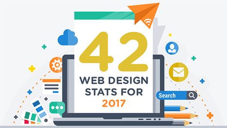

Are you considering a new website or even a redesign in 2017?
Need some facts and figures to help you form and execute your web strategy?
We share 42 stats you need to know in this infographic....
Get Started for FREE
Sign up with Facebook Sign up with X
I don't have a Facebook or a X account


 Your new post is loading...
 Your new post is loading...
Your new post is loading...
Are you considering a new website or even a redesign in 2017? Need some facts and figures to help you form and execute your web strategy? We share 42 stats you need to know in this infographic....
Jeff Domansky's insight:
Valuable stats to drive your website strategy. 
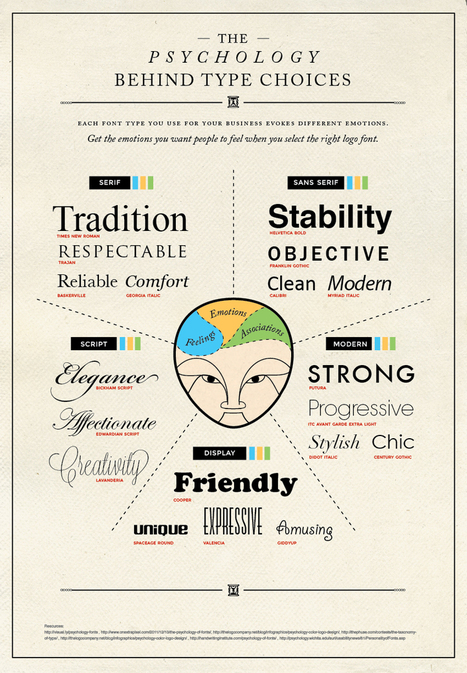
Cool advice...Today’s infographic covers the psychology behind type choices. You will learn how serif, sans serif, script, modern, and display typefaces and their fonts are best used for moving your audience to feel how you want them to feel....

Constance S. Ward's curator insight,
July 12, 2013 11:56 AM
Learn more about a subtle form of non-verbal communication

Miriam Gilbert's curator insight,
July 19, 2013 3:07 PM
nice infographic on how different fonts create a different "feel" for copy...

This infographic explores the psychology of color and suggests why brands like McDonald’s and Pizza Hut prefer red whereas Lowe’s opts for blue.

Zeebric's curator insight,
May 22, 2013 3:52 AM
Wow...never really considered colours! This infographic makes perfect sense, though 
WEDCBiz's curator insight,
May 22, 2013 10:21 AM
Not that all of us agree with painting our daughters' rooms pink, but still, color is something we should consider when branding our small businesses. 
Ali Anani's curator insight,
May 23, 2013 12:16 AM
A must reading to know your feelings and feelings of others |
Do you want to make your infographics iconic? Okay, so we don’t mean “iconic” in the usual sense. We mean using icons in your infographic design. Icons are those little illustrative graphic images/clip art that represent an object, action or idea. They are often stylized and simplified designs. N Using icons can make your infographic design more cohesive and more professional. With Venngage you can choose from over 10,000 icons in our icon library and stylize them to your preference by editing their colors, sizes and positions. Here are some tips for how to use icons in your infographics....
Jeff Domansky's insight:
6 ways to use icons in your infographic design. Quick infographic tips from Venngage.

Jeff Domansky's curator insight,
October 21, 2015 10:50 AM
6 ways to use icons in your infographic design. Quick infographic tips from Venngage.
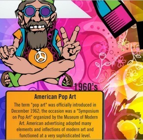
While I greatly appreciate my iPhone and its many self-computing functions, I have never taken the time to trace my gratitude back as far as Leonardo da Vinci or even as far as prehistoric cave drawings. According to this awesome infographic put together by The BOSS Group, I have many more to thank than just Steve Jobs. The creative process would not have begun had people not had an intrinsic desire to communicate with one another. Over time we have discovered and invented new ways to relay information to increasingly larger groups of people. By inventing printing and computing methods we have increased the need for creative workers in virtually every field. Without the creative side of organizations, the first Macintosh would not have been introduced, brand management would not be possible, and communication through beautiful imagery would cease to exist.
Jeff Domansky's insight:
Whimsical infographic is very creative and fun.

malek's curator insight,
June 25, 2013 5:31 PM
informative and funny, a reminder of the old saying: "The guy who invented the first wheel was an idiot; The guy who invented the other three, he was the genius. " |


Valuable stats to drive your website strategy.