World's Best Infographics
10.6K views | +0 today
Follow
World's Best Infographics
Celebrating the FINE ART of visual communication in social marketing
Curated by Jeff Domansky
Your new post is loading...
Rescooped by Jeff Domansky from Public Relations & Social Marketing Insight
Scoop.it!

Free Technology for Teachers: Five Good Online Tools for Creating Infographics

Free Technology for Teachers: Five Good Online Tools for Creating Infographics | World's Best Infographics | Scoop.it

In my previous post I shared some advice from Randy Krum, author of Cool Infographics, about creating infographics. In his book Randy devotes a chapter to design tools. Many of the tools used by professional designers cost hundreds or thousands of dollars. But you don't have to spend anything if you want your students to try their hands at creating a data visualization in the form of an infographic. Here are five free tools that your students can use to create infographics...

Jeff Domansky's insight:

Terrific tools for your PR and content marketing toolkit too. 

Jeff Domansky's curator insight, December 14, 2013 11:03 AM

I can vouch for three of these tools for use in marketing and PR too. A superb resource from Richard Byrne. Recommended reading 9 / 10.

Keepamericaheard Maria Catania's curator insight, December 14, 2013 4:44 PM

#keepamericaheard

Rescooped by Jeff Domansky from Public Relations & Social Marketing Insight
Scoop.it!

Telling Stories with Visual Data: A Glimpse into the Future of Narrative | Harvard Business Review

Telling Stories with Visual Data: A Glimpse into the Future of Narrative | Harvard Business Review | World's Best Infographics | Scoop.it

Below is a screen grab of a masterful interactive data visualization. This narrative-driven piece byPitch Interactive manages the extra-tricky task of balancing heavy subject matter with a clear story and compelling visuals. It's a glimpse into the future of data-driven storytelling. Perhaps the most interesting thing about the piece is that it wasn't commissioned by a media organization. It was built by Pitch as a way to explore and understand this complex topic. Bravo.


The full data visualization is here — it's worth watching, and scrolling over for a more in-depth view.

Jeff Domansky's curator insight, April 13, 2013 10:56 PM

Impressive storytelling using data.

Insight Narrator's comment, April 15, 2013 7:48 AM
Very rarely do I come across a great piece of data visualisation that I feel will really add value to the insight communication process, but this is a great example of combining technology, data insights and storytelling. Others should watch and learn.
Scooped by Jeff Domansky
Scoop.it!

Who's Sharing What - The State of Social Sharing in 2013 | Visual.ly

Who's Sharing What - The State of Social Sharing in 2013 | Visual.ly | World's Best Infographics | Scoop.it

We're discussing the latest trends in social sharing: the ecosystem gets busier and busier, and now everybody seems to share (and overshare) stuff all day within their social graph. We tried to zoom out as much as possible for you to be able to see the whole picture: the state of social sharing in the beginning of 2013 and everything you need to know about its eight major players. -- get stellar web hosting from http://www.webhostingbuzz.com/ get high quality infographics from http://mostash.com

Jeff Domansky's insight:

Find out who's sharing what in this interesting infographic.

Paula Arenas's curator insight, March 23, 2013 11:48 AM

Como por ejemplo, scooping o rescooping

Linda Dap's curator insight, March 26, 2013 12:27 PM

Geen Nederlandse cijfers, toch interessant om te zien wie wat op welk kanaal deelt.

Rescooped by Jeff Domansky from Public Relations & Social Marketing Insight
Scoop.it!

We Love Public Relations

We Love Public Relations | World's Best Infographics | Scoop.it
CIPR State of the Profession 2012/13: View the results in full here: http://www.cipr.co.uk/content/state-of-the-pr-profession-2013
Jeff Domansky's curator insight, February 21, 2013 2:23 PM

Here's a useful look at the PR profession in the UK.

Rescooped by Jeff Domansky from Public Relations & Social Marketing Insight
Scoop.it!

Five Elements of Inbound Marketing | ChooseWhat

Five Elements of Inbound Marketing | ChooseWhat | World's Best Infographics | Scoop.it

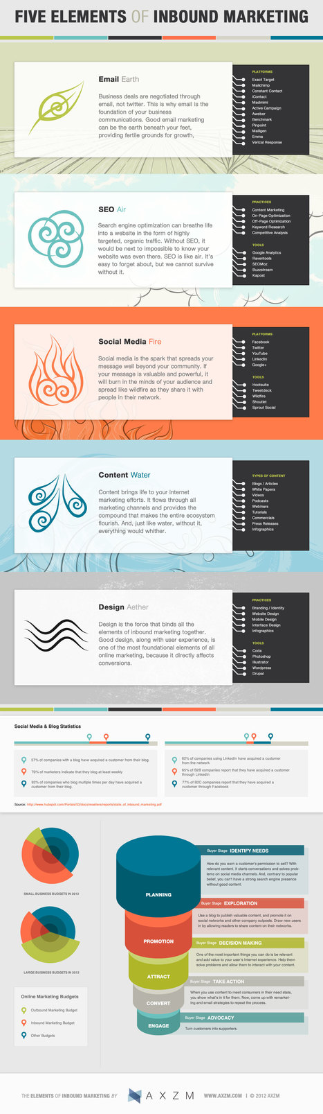
Recently we came across this great infographic by AXZM detailing the five elements of inbound marketing for your business. While they seemed to have channeled Captain Planet to design and categorize this infographic; using Earth, Fire, Air, Water, and the fifth element “Aether” that binds all other forces together.


It’s a great guide for a marketer or business owner just starting out in marketing. Each element is tied to an inbound marketing tactic and is partnered with a brief description of the benefit of each tactic, popular platforms, tools used and/ or best practices to implement.

What is Inbound Marketing?

Inbound marketing is a relatively new marketing concept where marketers aim at getting discovered by potential customers who are actively looking for your product or solution. This idea of “being where your customers are looking” contrasts the traditional way of marketing through television commercials, cold calling, direct mail, trade shows, etc....

Jeff Domansky's curator insight, February 18, 2013 12:53 PM

Helpful look at inbound marketing from definition to tactics. All tied together nicely in an infographic. 

Rescooped by Jeff Domansky from Public Relations & Social Marketing Insight
Scoop.it!

2013 NBA All-Stars Player Stats - Blog About Infographics and Data Visualization - Cool Infographics

2013 NBA All-Stars Player Stats - Blog About Infographics and Data Visualization - Cool Infographics | World's Best Infographics | Scoop.it

Rami Moghadam has just published two infographic posters detailing the stats for each of the players on the NBA All-Star teams. 2013 NBA All-Stars East and 2013 NBA All-Stars West both use radar charts to highlight each player’s strongest areas....

Daniel Carvalho's curator insight, April 23, 2013 6:00 PM

ligando a NBA à tecnologia, algo diferente com uma infografia sobre as estrela das equipas do fim de semana All Star, que ocorreu em Fevereiro

Zachary Ramondetta's curator insight, January 20, 2014 8:27 PM

As we approach the NBA allstar break here are some of the stats that are most showed for the players of the west.

Hyrum Alofipo's curator insight, March 26, 2014 7:27 PM

This article discusses NBA players stats through the use of Info graphic charts. This is very interesting as it uses color and very precise, accurate judgments through using numbers to provide players stats within the circle.

Rescooped by Jeff Domansky from Public Relations & Social Marketing Insight
Scoop.it!

10 Tools for Creating Infographics and Visualizations | SEOMoz

10 Tools for Creating Infographics and Visualizations | SEOMoz | World's Best Infographics | Scoop.it

...Communicating visually is one of the most effective ways to explain complex concepts and relationships, and can be a great way to explain your services/products and create valuable site content. I often use diagrams and whiteboarding in order to communicate new features and concepts internally with my team.


I've compiled a list of tools you can use to create visualizations, or simply use to communicate visually with your teammates....

Jeff Domansky's insight:

Great list of infographics tools. Check 'em out!

Jeff Domansky's curator insight, February 6, 2013 10:28 PM

Great overview and list of cool infographic tools by Miranda Rensch.

Rescooped by Jeff Domansky from Infographic Burst
Scoop.it!

CHART: What Makes a Good Infographic?

CHART: What Makes a Good Infographic? | World's Best Infographics | Scoop.it
Infographics are visualizations of data that can help audiences quickly grasp complex sets of ideas.

Via DashBurst
Jeff Domansky's insight:

Good visual depiction of the ideal infographic...

No comment yet.
Scooped by Jeff Domansky
Scoop.it!

Welcome to World's Best Infographics

Welcome to World's Best Infographics | World's Best Infographics | Scoop.it

Welcome to World's Best Infographics.


This site is curated by Jeff Domansky, aka The PR Coach. While I'm a social PR consultant, I also appreciate the FINE ART of infographics. Sometimes they're art, sometimes they're marketing or information and when they work together, they are wonderful communication!


The infographics I curate here are mostly include marketing, public affairs, communications, branding, graphic design, social marketing, advertising and PR themes. Once in a while, just to shake things up, I like to add something off the wall. I hope you enjoy them.

No comment yet.
Scooped by Jeff Domansky
Scoop.it!

Sustainable Paper from Plantation to Product

Sustainable Paper from Plantation to Product | World's Best Infographics | Scoop.it
No matter where you stand, sustainability is an important issue. We must protect the earth if we want it to protect us. Efforts to use a little more sensibly are popping up all over the place.
No comment yet.
Scooped by Jeff Domansky
Scoop.it!

How Social Media Distracts You at Work

How Social Media Distracts You at Work | World's Best Infographics | Scoop.it
This infographic details how social media interruptions impact employee productivity.
No comment yet.
Scooped by Jeff Domansky
Scoop.it!

The Awesome Science of Mindmapping | Visual.ly

The Awesome Science of Mindmapping | Visual.ly | World's Best Infographics | Scoop.it
Mindmapping is a very serious and well researched subject, or art … or something . Whatever it is a map of the mind is definately something to be
No comment yet.
Scooped by Jeff Domansky
Scoop.it!

How to Get Rid of a Tattoo | Visual.ly

How to Get Rid of a Tattoo | Visual.ly | World's Best Infographics | Scoop.it
Getting a tattoo is a popular way to permanently express oneself. While the reasons for getting a tattoo vary often times the novelty of expression c
Jeff Domansky's insight:

Sometimes they're art, sometimes they're information, and when they're both, they are great communication.

No comment yet.
Rescooped by Jeff Domansky from Public Relations & Social Marketing Insight
Scoop.it!

Infographics

Infographics | World's Best Infographics | Scoop.it

An infographics collection showcasing some of the best internet marketing and social media graphics for B2B and B2C marketers. Begin here.

Jeff Domansky's curator insight, November 9, 2013 12:49 PM

Kayak has an excellent collection of infographics for marketing and Digital PR pros.

Ritu's curator insight, August 6, 2014 1:39 PM

Some really good infographics!

Scooped by Jeff Domansky
Scoop.it!

Best Practices for Promoting Infographics | Search Engine People

Best Practices for Promoting Infographics | Search Engine People | World's Best Infographics | Scoop.it

With thousands of infographics posted on a daily basis, it can take a lot of work to get your latest creation the online attention it deserves. This can be problematic if you've invested the time, money and resources and the infographic fails in promotion. As the owner of both an infographic design agency and an infographic submission website, I've seen my share of promotion wins and promotion flops. While not all infographics have what it takes to make it in even the best of promotion circumstances, here are some tips for success....

Jeff Domansky's insight:

Solid tips for promotiong your next infographic.

No comment yet.
Rescooped by Jeff Domansky from Public Relations & Social Marketing Insight
Scoop.it!

A Delicious Pie Chart for Pi Day! | Cool Infographics

A Delicious Pie Chart for Pi Day! | Cool Infographics | World's Best Infographics | Scoop.it

In honor of Pi Day (3/14) we took a dive into our library to suss out some Pie Knowledge, and ended up with the above appetizing infographic revealing the flavor breakdown of the 85,748 “pie” search results from our library. Yes, we know that “Pi” equals 3.14159… and not “Pie,” but we couldn’t resist the delicious comparison. Any way you slice it, this is some tasty data, and our mouths water for data here at Shutterstock.

Jeff Domansky's curator insight, March 16, 2013 11:09 PM

Some infographics are just very tasty.

Rescooped by Jeff Domansky from Public Relations & Social Marketing Insight
Scoop.it!

How to Size Images on Social Media: A Cheat Sheet | Cyberjournalist

How to Size Images on Social Media: A Cheat Sheet | Cyberjournalist | World's Best Infographics | Scoop.it
Jeff Domansky's curator insight, February 18, 2013 10:36 PM

This is an excellent resource for bloggers and web designers. It illustrates how a good infographic can deliver practical, useful information.

Scooped by Jeff Domansky
Scoop.it!

Storytelling: One Frame at a Time | Best Infographics on the Planet

Storytelling: One Frame at a Time | Best Infographics on the Planet | World's Best Infographics | Scoop.it

The numbers don't lie.- A brand's best story is framed online with photos  or video. On Facebook, videos are shared 12x more than links and text combined. Photos are liked 2x more than text updates. 42% of Tumblr posts are photos. Over 700 YouTube videos are shared on Twitter every minute.


Need we say more?

Jeff Domansky's insight:

The numbers are convincing. Visuals tell the story... every time.

No comment yet.
Scooped by Jeff Domansky
Scoop.it!

Lessons from the Top Socially Devoted Brands of 2012 | Jason Cruz

Lessons from the Top Socially Devoted Brands of 2012 | Jason Cruz | World's Best Infographics | Scoop.it

If there is one thing I’ve noticed in social media marketing, it’s that virtually every brand, company, or organization on social is worried to death about being “engaging” (or the lack thereof). There are two issues here preventing ‘real engagement’: first, ‘engagement’ is rarely defined, and two, ‘engagement’ is a two-way street – not the one-way information stream many brands practice on social media. How did 2012 look in terms of being “socially devoted” then?


SocialBakers, the social media marketing measurement company based in Europe, has released their Socially Devoted Report for the 4th Quarter of 2012, giving a peek at changes on how brands and companies practice ‘social devotion’ (if such a word could be used)....

Jeff Domansky's insight:

Marketers will find this research relevant and useful.

No comment yet.
Rescooped by Jeff Domansky from Public Relations & Social Marketing Insight
Scoop.it!

5 Tips for Easier Writing - Infographic - Strategic Public Relations

5 Tips for Easier Writing - Infographic - Strategic Public Relations | World's Best Infographics | Scoop.it
While this infographic has five tips to help brands create content,** the tips apply to anyone -- including you. We encounter multiple stories on a daily basis, regardless of our job.
Jeff Domansky's curator insight, February 6, 2013 7:02 PM

Practical PR writing tips in infographic form.

Rescooped by Jeff Domansky from Digital Marketing Fever
Scoop.it!

The Best Infographics on the Planet

The Best Infographics on the Planet | World's Best Infographics | Scoop.it
Infographics that describe Social Media, Wordpress Plugins and Blogging

Via Anthony Burke
Jeff Domansky's insight:

Excellent resource for you infographics lovers...

Anthony Burke's curator insight, February 4, 2013 5:09 PM

A good resource for infographics

Scooped by Jeff Domansky
Scoop.it!

Win Rock Paper Scissors Every Time | Daily Infographic

Win Rock Paper Scissors Every Time | Daily Infographic | World's Best Infographics | Scoop.it
So the winner of this competition gets to be on TV (Even broadcasted in Turks and Caicos) and a check for $10,000. Yeah, where is this competition held, cause I'm in.
No comment yet.
Scooped by Jeff Domansky
Scoop.it!

Public Relations Job Hunter's Guide: Infographic

Public Relations Job Hunter's Guide: Infographic | World's Best Infographics | Scoop.it
This infographic shows the rapid growth of public relations jobs, the impact and opportunities created by social media and shares tips and resources for serious PR job hunters.
No comment yet.
Scooped by Jeff Domansky
Scoop.it!

Social at Work Infographic

Social at Work Infographic | World's Best Infographics | Scoop.it
Appirio has some statistics and an infographic out of a survey it conducted on the state of the social enterprise
No comment yet.
Scooped by Jeff Domansky
Scoop.it!

Sink or Swim: How to Brand Without Getting Eaten Alive | Visual.ly

Sink or Swim: How to Brand Without Getting Eaten Alive | Visual.ly | World's Best Infographics | Scoop.it
Branding isn't easy. If it was, every business in the world would have a successful ad campaign and company. With strong ideas and a good execution pl
No comment yet.