 Your new post is loading...
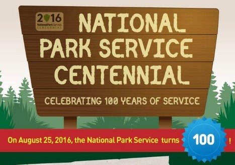
Nothing is better or as invigorating as the great outdoors. If you think about it, the U.S. consists of a wide variety of geographic landscapes, natural wildlife and plants, as well as unique ecosystems. We are able to enjoy these wonders fully thanks to the efforts of the National Park System. The National Park System is celebrating its 100th year of service on August 25 of this year. Because of their efforts, more than 307 million people are able to recreationally visit our national parks, battlefields, monuments and more. We need to stay in touch with not only nature, but also our own national history. The National Park Service achieves exactly that and more. Currently, there are 22,000 park employees and 221,000 volunteers that keep the National Park Service running smoothly.
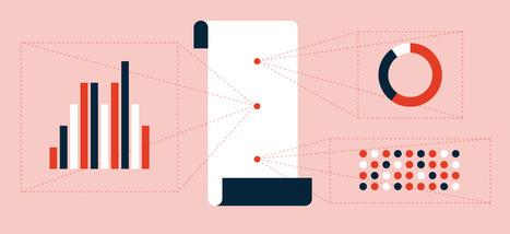
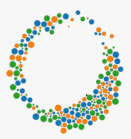
A picture is worth a thousand words – based on this, infographics would carry hundreds of thousands of words, yet if you let a reader choose between a full-length 1000-word article and an infographic that needs a few scroll-downs, they’d probably prefer absorbing information straight from the infographic. What’s not to like? Colored charts and illustrations deliver connections better than tables and figures and as users spend time looking back and forth the full infographic, they stay on the site longer. Plus, readers who like what they see are more likely to share visual guides more than articles. While not everyone can make infographics from scratch, there are tools available on the Web that will help you create your very own infographics. In this article, we’re listing more than 20 such options to help you get your messages across to your readers, visually....
Via Ana Cristina Pratas
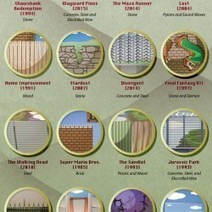
From the Secret Garden to Pacific Rim, this infographic details 24 fictional fences and walls from our favorite movies, television shows, video games.
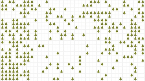
Emoji are a great way to express yourself. Through Simulating the World, the latest interactive web toy by artist Nicky Case, they're more than just cute stickers. They become a tool for thinking about systems, illuminating how everything from forest fires to flu pandemics start, or spread out of control. Simulating the World is a time-lapsed grid that is semi-randomly populated with whatever emoji you choose, according to certain user-defined rules: what happens when an emoji spawns to another emoji that is different, for example. It doesn't sound like much, but used intelligently, this emoji grid is enough to simulate, if not predict, how all sorts of systems work: how a bolt of lightning can decimate a forest during a drought year, for example, or how neighborhoods can desegregate over time....
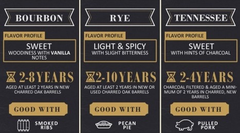
Drink up boys and girls. Today’s graphic will not only inform, but you’ll get to test your whiskey knowledge. How much do you know?
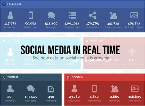
The data used on this page was fetched from sources around the web referenced in above link. Some statistics are based on a yearly reported data and are thus averaged down to per second basis and do not represent actual real time data but rather very accurate approximation of real time growth. - See more at: http://www.coupofy.com/social-media-in-realtime/#sthash.yCfBpC0B.dpuf
In terms of visually displaying information, infographics serve as an ideal way to convey a complex idea in an interesting and manageable format. Whether it's a comprehensive side-by-side comparison, a lengthy timeline, or robust collection of numbers and statistics, a well-designed infographic can help you make your point without fussing over a ton of words.
The big issue is, of course, the amount of time needed to create infographics. Nearly 66% of marketers reported that both lack of time and staff resources are the biggest challenge to creating effective visual marketing, according to a report from Digiday and Chute.
That's where we come in. We've created 20 fully customizable infographic templates that will give you the inspiration and foundation you need to build your own infographics -- 15 templates in PowerPoint with an additional five versions in Adobe Illustrator. Here's a sneak peak at what you can expect:...
When the worlds of content and data meet, infographics are born. That means 2015 was a pretty great year.
At Visually, we don’t believe in wasting time, so we’ve pulled together all the best and brightest infographics in one place. To give the search for the best a little direction, we tried to select infographics that: - Use design to succinctly tell a story that images, data, or words couldn’t have conveyed on their ownInclude a narrative that keeps the viewer engaged (as opposed to a list of facts or data points) - Require little or no additional context to be understood - Create an emotional connection to the information that’s being shared.
Mull over these fine specimens to get fired up for some awesome content creation in 2016. Or if you want to dig deeper, check out the complete list of our staff picks from the Visually Community. You know you want to!...
Whether you’re looking to wow your audience at your next presentation or you are a developer looking for a practical way to visualize large sets of data, there are amazing tools out there for both parties. So many that it’s hard to find the right tool for your project.
Want to know the best part?
We made everything easy for you and prepared a series of reviews that cover all the features of the best data visualization tools out there. And we divided our reviews in two sections: data visualization tools for presentations and data visualization tools for developers.
Here are reviews of our 20 best tools for Big Data visualization....
Do you want to improve the quality of the infographics you create? Want more people to share and link to your work?
Infographics are a great way of showing the world (especially Google) that you’re an expert in your field, but only if the design is of a sufficient standard. Graphics that are hard to read or poorly designed simply won’t generate the desired results.
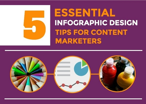
For help improving your infographic design skills take a read of this infographic from Venngage....
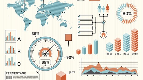
Data presentation should be elegant, detailed and beautiful. There are different ways to show the data that can be a pie charts, tables, histograms, and bar graph. However, to send a clear and effective message to your readers, you just need more than just a simple table or histogram, etc.
There are some data visualization techniques that present your data much better than expected, intelligent, beautiful, original and in an excellent way. We have gathered some of the most attractive and unique ideas of data visualization examples....
Animated and interactive infographics, especially those designed using HTML5, are quite possibly the future of infographics. Animated infographics engage with viewers better and can help add interest to topics that might otherwise come across as mundane.
Here’s a list of 20 animated and interactive infographics that you can enjoy and find some inspiration from. Do click into the links to get to the full version of the infographics, complete with the animation....
As someone said, “A picture is worth more than 1000 words.” In the present scenario, a picture is a very good way to share and summarize your blog content. You can use chart, Information and text together to create an Infographic. Infographics are quite popular on Social-media sites & readers love it as it convey the message in an easy to understand format.
Most of the bloggers think that you need to be a highly skilled designer to create an infographic, which is not entirely true. These days there are many online Infographic maker sites are there to help users like you & me to create Infographics for our blog post. This is your handy guide to learn everything about designing Infographics for your blog even if you have not done it before....
|
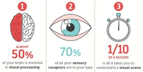
Think back to your first memory: Can you still see the watermelon pink dress you wore? Do you remember the unique checkered pattern of your father's jacket?
Our memories are often linked to visual and sensory elements, while the words spoken or read can be more hazy. That's because our brains have a high capacity for storing visuals in our long-term memory, while text enters our working memory, which is limited.
This contributes to why infographics and the inclusion of visual content in online information has been so successful. Readers crave visual breaks from the overload of text-based information that floods our daily browsing and work-related activities.
NeoMam Studios studied how people process visual information, how visuals affect the way we read, and why graphics are so appealing. Discover the science behind why our brains crave infographics....
What’s even better is to learn how each of these elements should be used with blogging through the use of powerful and engaging infographics. Once you have a good idea on what type of blogger you want to be and how you are going to start scaling up your content and reaching new audiences, then it’s time to set your sights on how having a blog can really change your life and business for the better! Now let’s take a look at ten unique infographics that will help you get to “All-Star Blogger” status at a faster pace....
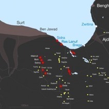
Since Islamic State (IS) has damaged many of Libya's Oil fields, ports and pipelines. This info graphics helps clarify the location of the damaged infrastructure relevant to locations where ISIS is present in Libya.
In today’s multimodal world, there’s no such thing as one size fits all. When you have a great idea that demands recognition, why not use every possible avenue to make sure your message gets heard?
Traditionally, infographics have been the end-medium for repurposing content, and though this is a tried and true method to broaden your reach, it’s really only the beginning of what you can do with that content once it’s an infographic.
This post will explore a few methods for repurposing your infographic into other media....
Infographics are awesome, simply because they can capture and hold our attention so well - if done right. The best part is, there are so many great examples out there…
It's fair to say that 2015 has been an explosive year for infographics. Thanks to viral posts that explore everything from the risks of drinking diet coke, to quick funny hits exploring the creative process, the last twelve months have seen some amazing data visualizations.
Unsuprisingly, some of the most beautiful and educational infographics in 2015 have been all about design, so we've collected 10 of the best below to round off your year and kickstart your creativity for 2016....
So why are some infographics destined to die in obscurity while others get passed along to every corner of the web?
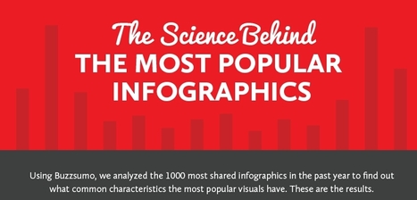
Content marketing researchers have been burning the midnight oil trying to figure out how to reliably produce viral content. After observing and analyzing a thousand different infographics across multiple industries and platforms, the team at SiegeMedia collected some interesting insights and patterns. As it turns out, going viral isn't entirely up to the hands of fate - the most popular content shared certain key characteristics.
Take a look at the following visual and learn what makes an infographic popular...
Not a web designer or developer? You may prefer free tools for creating infographics.
As author, data journalist and information designer David McCandless said in his TED talk: “By visualizing information, we turn it into a landscape that you can explore with your eyes, a sort of information map. And when you’re lost in information, an information map is kind of useful.”
There are many different ways of telling a story, but everything starts with an idea. So to help you get started we’ve rounded up some of the most awesome data visualization tools available on the web....
Being a visual designer can be challenging and invigorating at the same time. On the downside, you are expected to perpetually work at your creative peak, while also pleasing other people’s aesthetic preferences. On the positive side, you get to create fun and beautiful artwork for a living.
To inspire you in your daily work as a graphic artist, we’ve compiled a list of insightful infographics with useful tips and design hacks. Valuable for both amateurs and professionals, these visual guides will surely become a part of your own personal collection of design manuals that can also be shared with your colleagues and friends....
Creating a really cool, memorable and–above all–shareable infographic comes down to investing the necessary time and attention in all the steps that lead up to an awesome data visualization.
In a previous series of posts, we discussed the steps to creating your own infographic. One of the key elements in this process is understanding that information can be categorized in one of five ways: - Chronologically
- Alphabetically
- Geographically
- Categorically
- Hierarchically
The visual format you choose will depend on how you want to organize your information. To help you identify which type of infographic will best serve your purpose and audience, we’ve compiled a list of the most-used types, along with advice on when to use them and examples of each....
The best infographics are like good novels: They grab you by the collar, transport you to another world and refuse to let go until the real world steps in and gives you a rude awakening.
This is how I felt when I picked up Gareth Cook’s The Best American Infographics 2015, the third volume in a series of infographic compilations.
Like an avid reader absorbed in a gripping tale, I found myself poring over these visual stories, eager to distill the meaning contained within each of them.
From breath-taking illustrations to ingenious visualizations, these beautiful data worlds introduced me, in each case, to a reality I didn’t know existed. At first glance, they might seem like abstract eye candy, but if you take the time to delve into each of them, they can change your perspective of the world like nothing else can....
The best infographics of 2015 are some of content marketing’s finest examples of visually engaging content. As platforms for content continue to proliferate, it’s important to test new content types while also continuing to utilize those that have served you well in the past. Infographics might not be as sexy as vines or videos, but they are solid, tried-and-true options.
Since 90% of the information we take into our brains is visual, it makes sense that these are among the best content types to deploy. As Adobe’s Social Intelligence report noted, posts that have images are 600x more likely to be shared on social media and to receive engagement elsewhere.
Here are the brands and publications that provided us with the best infographics of 2015....
|


![15 Customizable Infographic Templates for PowerPoint [Free Download] | Public Relations & Social Marketing Insight | Scoop.it](https://img.scoop.it/L0tDVg9NsiVawXTRHsBEZzl72eJkfbmt4t8yenImKBVvK0kTmF0xjctABnaLJIm9)


Cool infographic and interesting National Park Service facts.