


 Your new post is loading...


Light colors are easy on the eye, which means that they aren’t as likely to take attention away from the main goal or goals of a site. Negative space, on the other hand, makes websites look less cluttered and easier to navigate. Even though negative space can actually be filled with any color, white is typically the safest bet. For example, a brand like Best Buy is associated with the colors blue and yellow, but the company primarily uses these colors in the navigation menu of its site, which leaves plenty of whitespace to help guide visitors' eyes to calls-to-action (CTAs) like "Shop" and "Find out more."
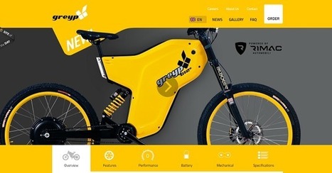
Some brands, however, are okay with challenging the rules of Web design and are doing so with colorful designs that are pushing the best-practice boundaries. Although colorful designs are certainly not for everyone, they can be successful when they are executed correctly and used for the right brand. For some inspiration, check out the six colorful websites featured below...


Nothing like a little design inspiration in these six websites provide that in spades.